
Type History Poster
Overview
Role: Designer | Duration: 3 weeks
This project focused on designing a type specimen and history poster using only a single typeface: Century Gothic. The goal was to explore the visual and historical characteristics of the typeface while creating a compelling, well-structured layout. I researched the origins of Century Gothic, analyzed its formal qualities, and translated those insights into a typographic composition that relies entirely on hierarchy, spacing, and form, without the use of additional typefaces.
The primary constraint of this project was the limitation to a single typeface. Without the ability to rely on contrasting fonts, I had to create visual hierarchy, rhythm, and clarity using only variations in scale, weight, spacing, and composition. This required a deeper understanding of typographic systems and careful attention to details such as leading, kerning, and alignment. Additionally, the poster needed to communicate both the history and defining characteristics of Century Gothic in a visually engaging way.
Research & Inspiration
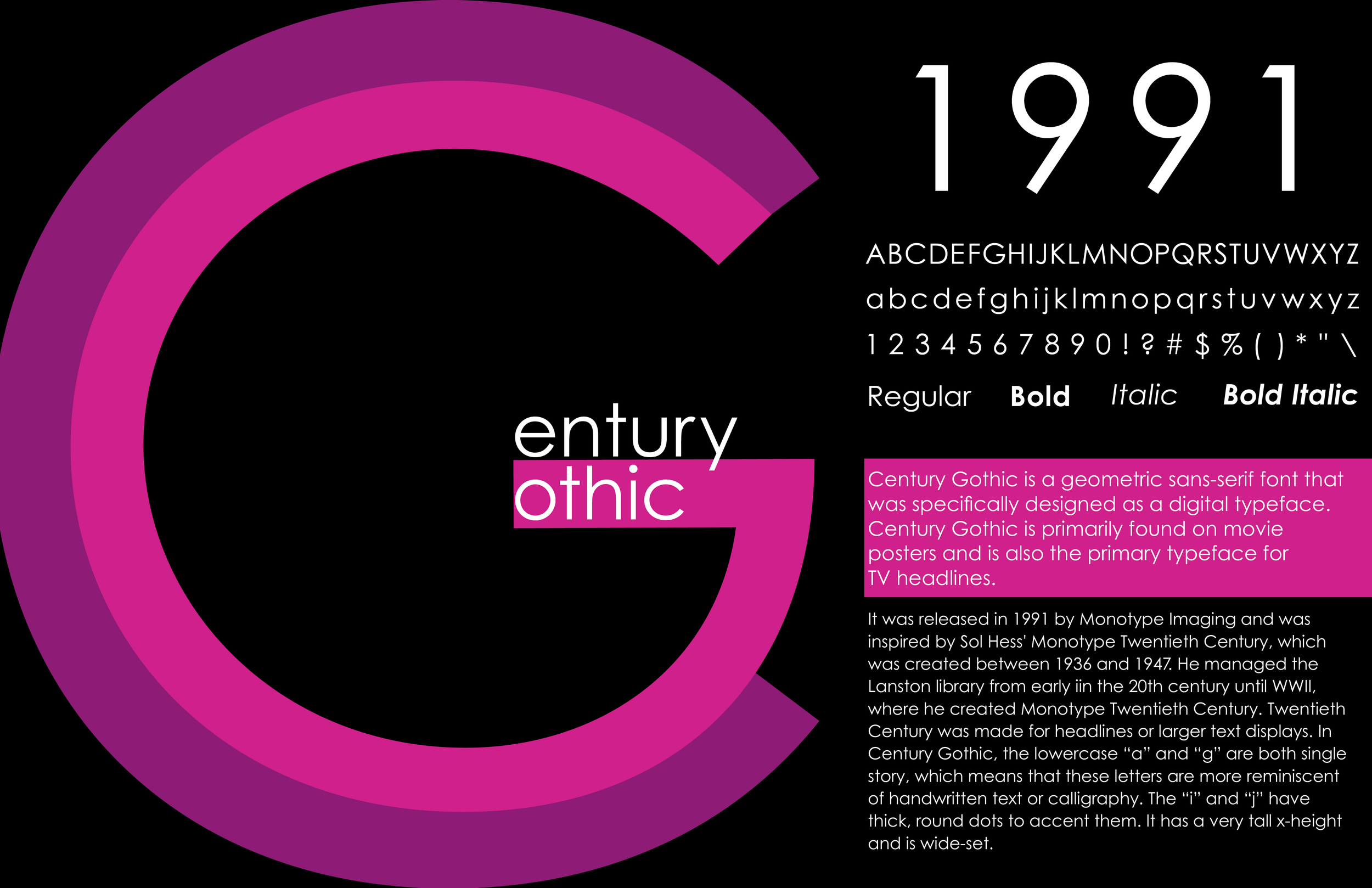
Through my research, I learned that Century Gothic is a geometric sans-serif typeface released in 1991 by Monotype Imaging and inspired by Sol Hess’ Twentieth Century. Its construction is based on clean geometric forms, which is especially evident in characters like the “C” and “G.” I also noted its tall x-height, wide proportions, and single-story lowercase letters, all of which contribute to its modern, highly legible appearance.
These insights informed my design direction. I chose to emphasize the typeface’s geometric structure and digital origins by building compositions that highlight circular forms, consistent spacing, and clean alignment. Understanding that Century Gothic is often used in headlines and display contexts also pushed me to experiment with scale and bold typographic moments.
Ideation & Sketches
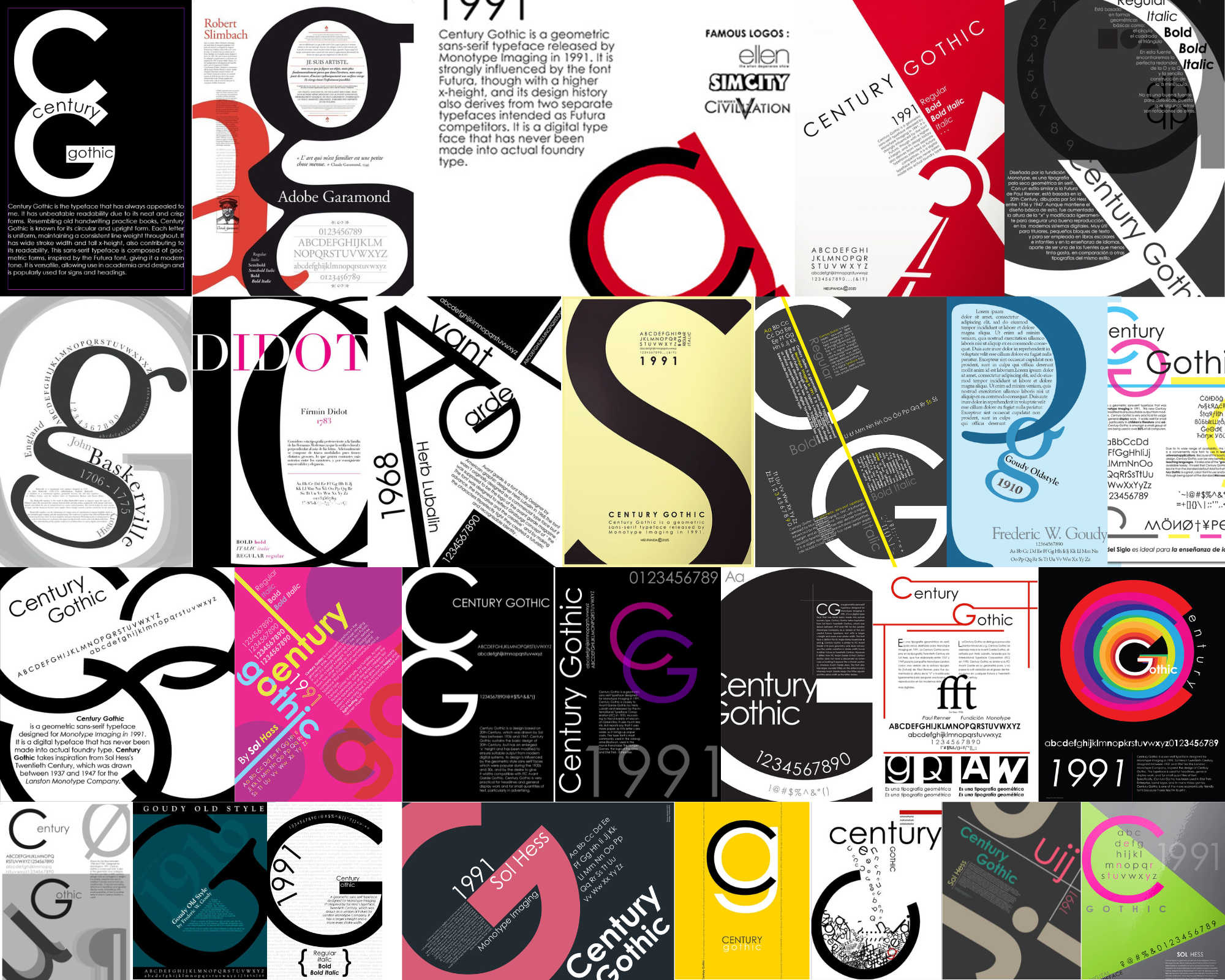
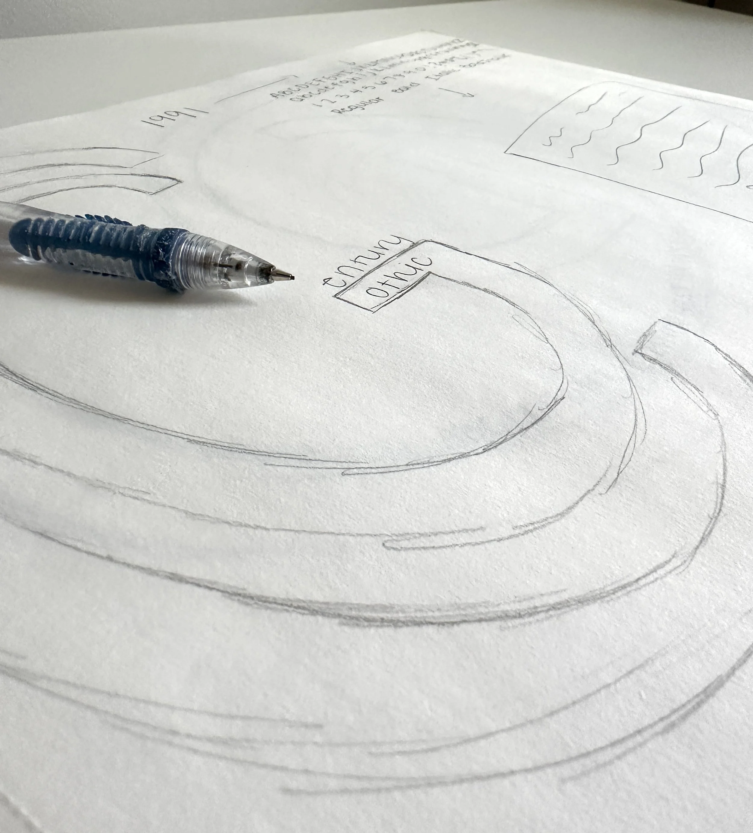
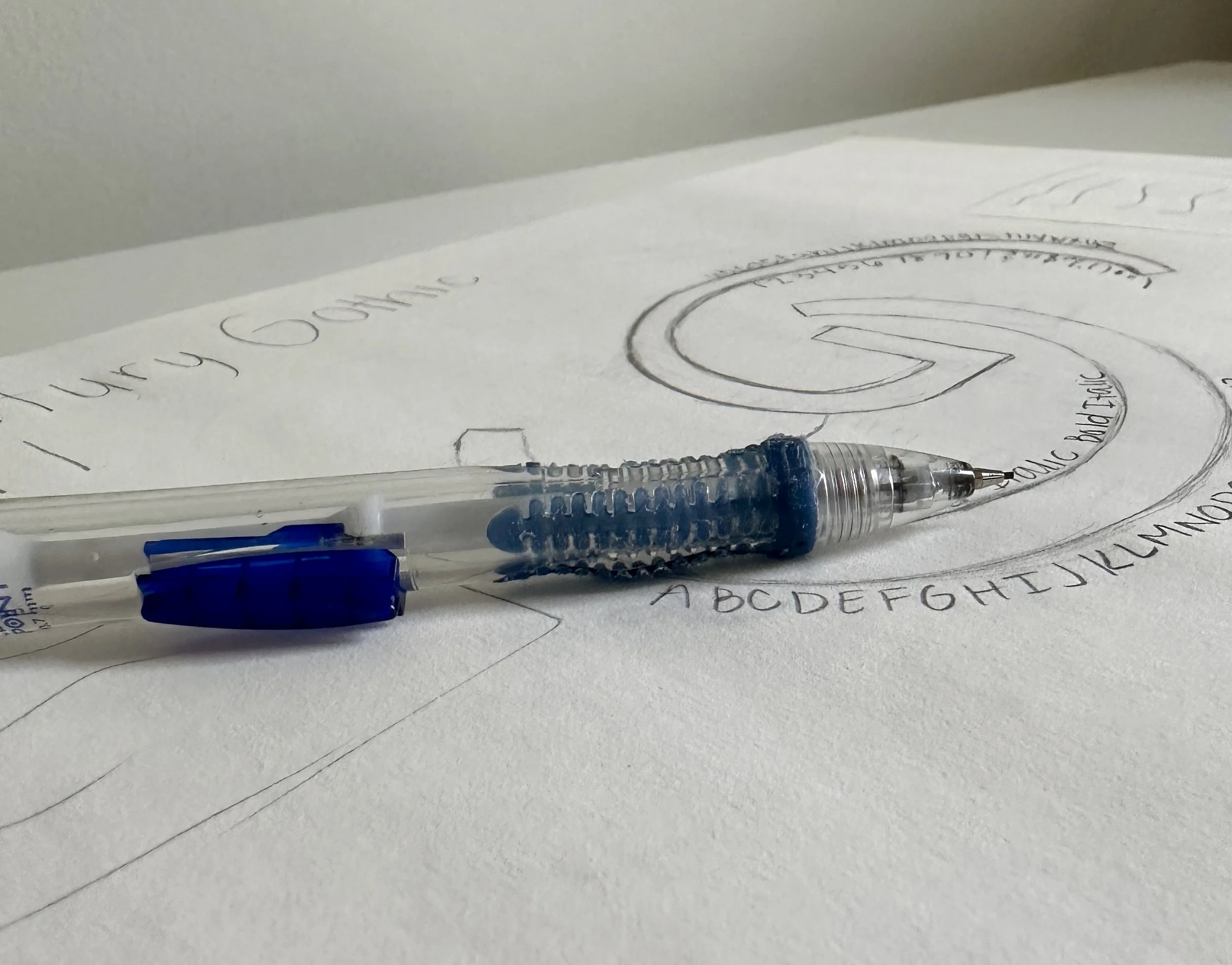
I sketched three distinct poster concepts, each exploring a different approach to hierarchy, composition, and the use of Century Gothic’s geometric forms. In these initial sketches, I focused on how to organize large amounts of typographic information while still creating a clear visual flow. I experimented with scale to establish focal points, used alignment systems to create structure, and explored how the letterforms themselves, particularly circular shapes like the “C” and “G,” could drive the overall composition.
Digital Design & Iteration
I translated each of these concepts into digital compositions, which gave me a clearer understanding of how the layouts would function at full scale. Creating digital versions of all three designs allowed me to test hierarchy, spacing, and readability more accurately, and evaluate which concept was most successful in communicating the typeface’s characteristics.
After comparing the digital iterations, I selected the strongest direction based on clarity, visual impact, and its ability to highlight the defining features of Century Gothic. From there, I refined the chosen design through multiple rounds of iteration.
Critiques played a key role in improving the work. Feedback identified issues with spacing, alignment, and readability—such as adjusting leading, refining kerning in the alphabet displays, and breaking up dense text blocks. I used this feedback to make targeted revisions, resulting in a more balanced composition with stronger hierarchy and improved legibility.
Direction 1
Direction 2
Direction 3
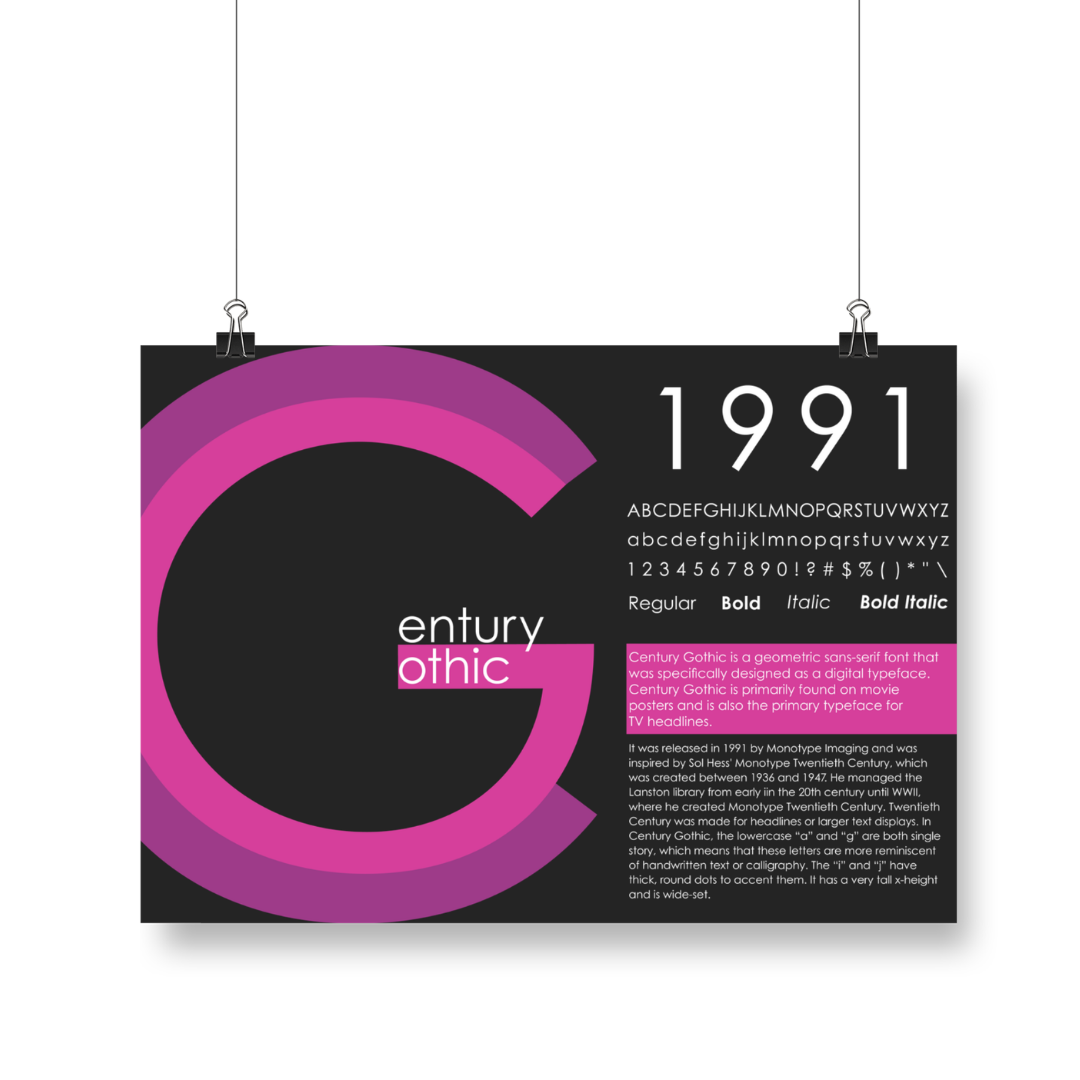
Final Product
The final poster presents Century Gothic through a structured yet dynamic layout that emphasizes both form and information. Large-scale typographic elements draw attention to the name and date, while supporting text provides historical context and key characteristics.
I focused on alignment and spacing to guide the viewer’s eye through the composition. The layout balances dense informational sections with open space, improving readability while maintaining visual interest. By highlighting the geometric qualities of the letterforms and maintaining a clean, minimal aesthetic, the design reflects the essence of Century Gothic itself.
Outcome
This project strengthened my understanding of typography as a system rather than just a visual tool. Working within strict constraints pushed me to be more intentional with hierarchy, spacing, and composition. It also reinforced the importance of critique and iteration in the design process.