
Beyond the Best
Overview
Role: Designer | Duration: 3 weeks
Beyond the Best is a podcast created by The Agency at Quinnipiac University that explores the behind-the-scenes experiences of account executives and their clients. Focused on process, collaboration, and real-world agency dynamics, the podcast reveals the work that exists beyond final deliverables.
This project centered on developing a logo that extends the agency’s established brand system while introducing a clear, recognizable identity for the podcast. The solution required working within strict visual constraints while still creating a distinct and concept-driven mark.

Research & Inspiration
The process began with analyzing The Agency’s visual identity, focusing on its typographic system, color palette, and overall tone. Rather than introducing new elements, the project focused on working within these constraints to maintain cohesion across all branded materials.
Ideation & Sketches
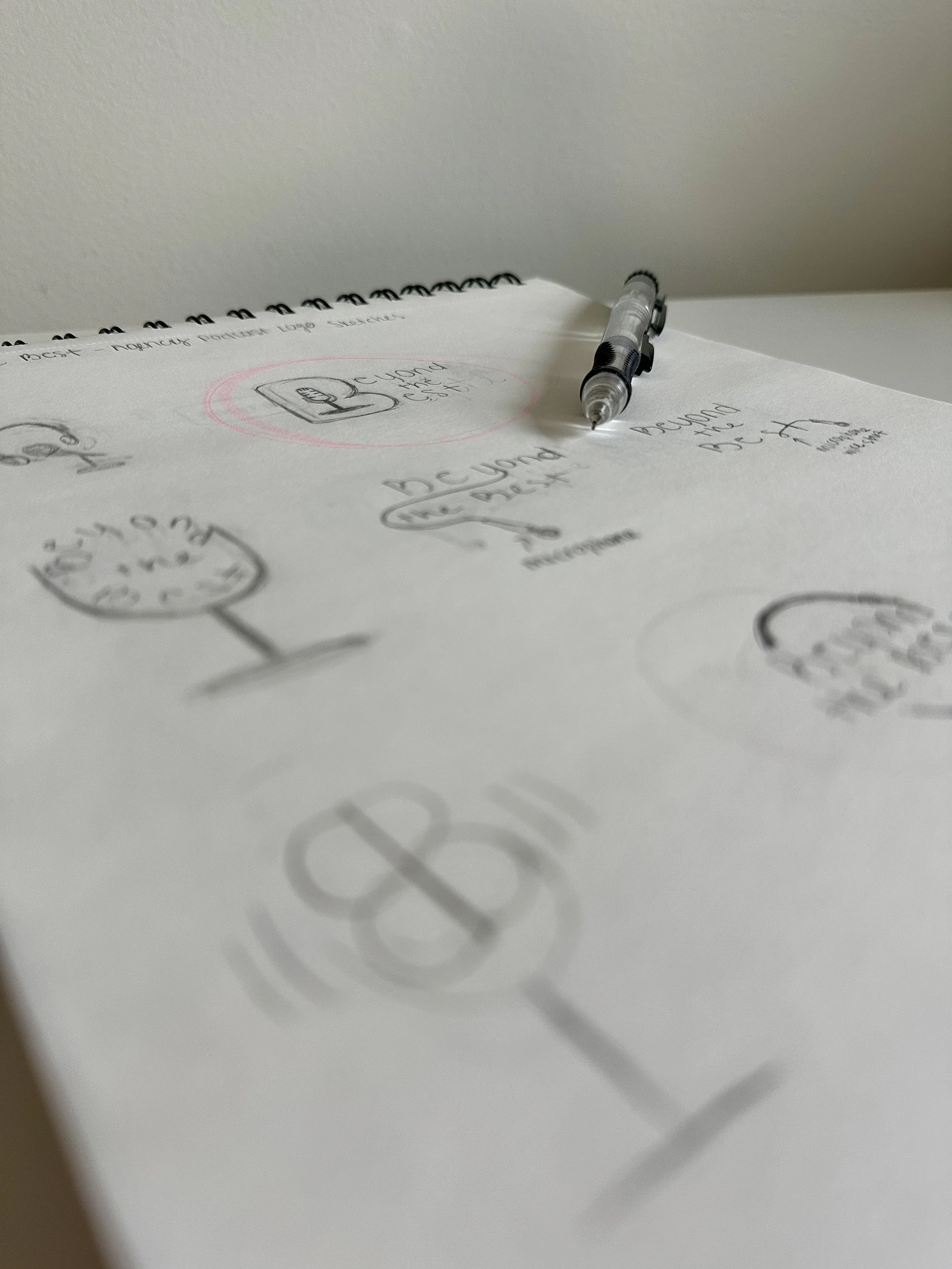
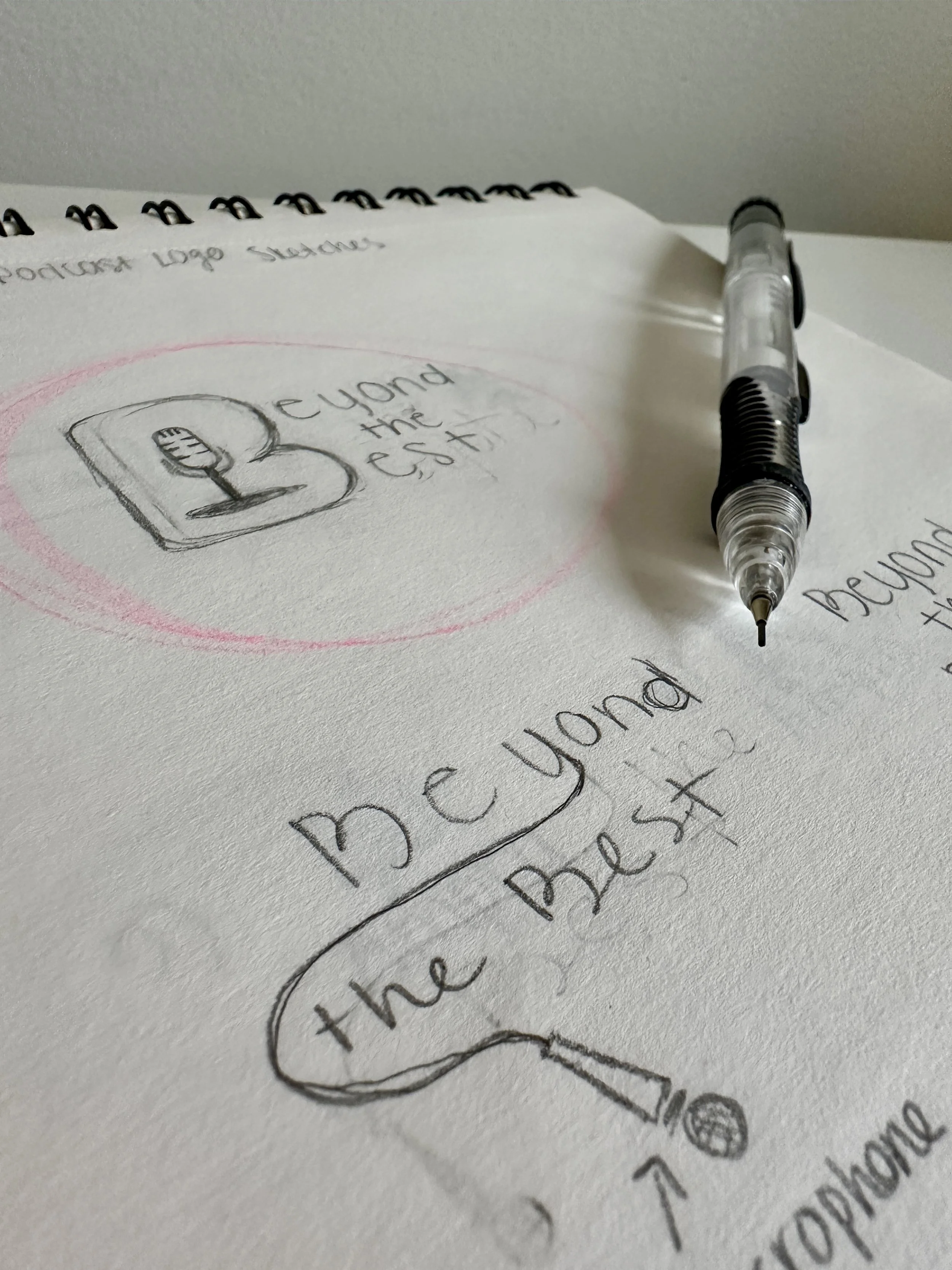
Early concepts explored how to merge typography and symbol into a single, unified form. The letter “B” became the primary structure, functioning as both an initial and a visual container.
The direction evolved around embedding a microphone within the letterform using negative space. This approach allowed the design to communicate its purpose without relying on separate or competing iconography, reinforcing a more integrated and minimal solution.
Digital Design & Iteration
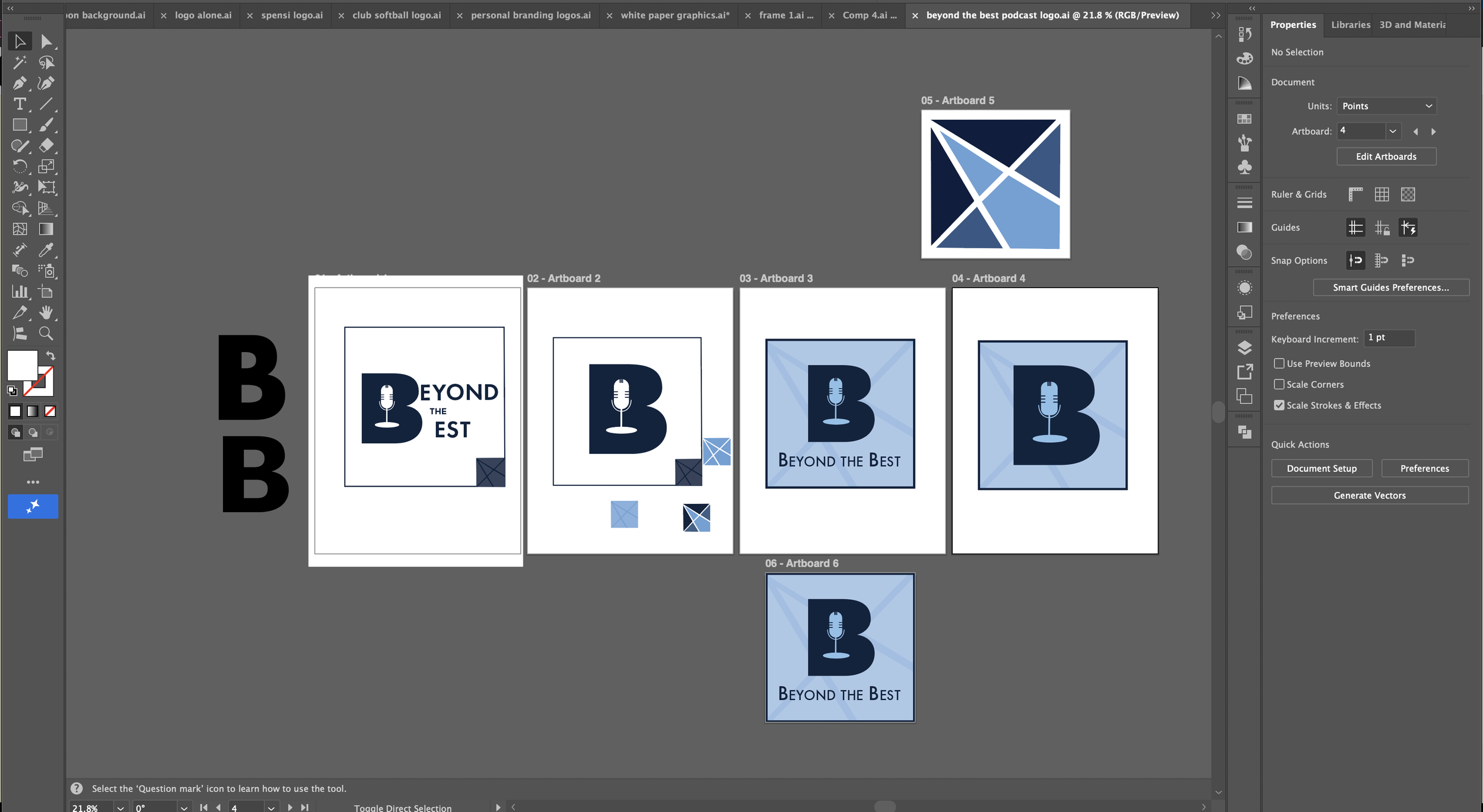
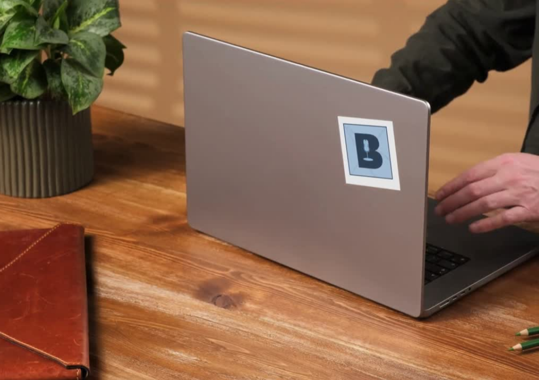
In the final design, the “B” is scaled into a bold, dominant form, creating a strong visual anchor. The microphone is centered within the letter, using simplified geometric shapes to maintain clarity and legibility at small sizes. This creates a dual-reading mark: the letterform establishes identity, while the internal symbol communicates function.
The color palette remains consistent with The Agency’s branding, using a deep navy for the primary form and a lighter blue for contrast and background. The subtle geometric pattern in the background adds depth without distracting from the focal point, while also reinforcing a polished, professional tone.
Typography for Beyond the Best is set in the agency’s established typeface, with careful attention to spacing and hierarchy. The word “Beyond” carries visual weight, while “The Best” supports it, creating a clear reading flow.
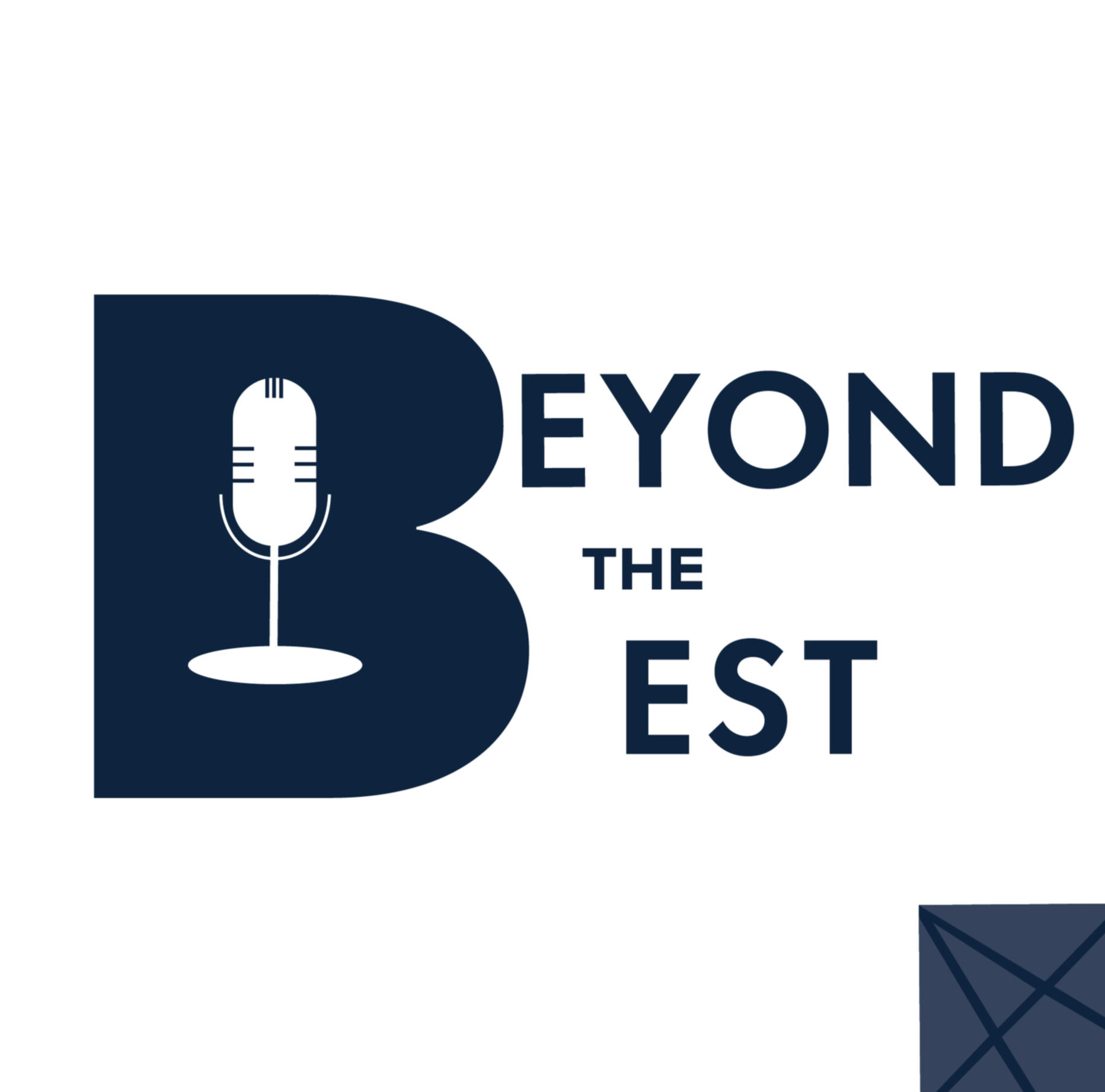
First Design
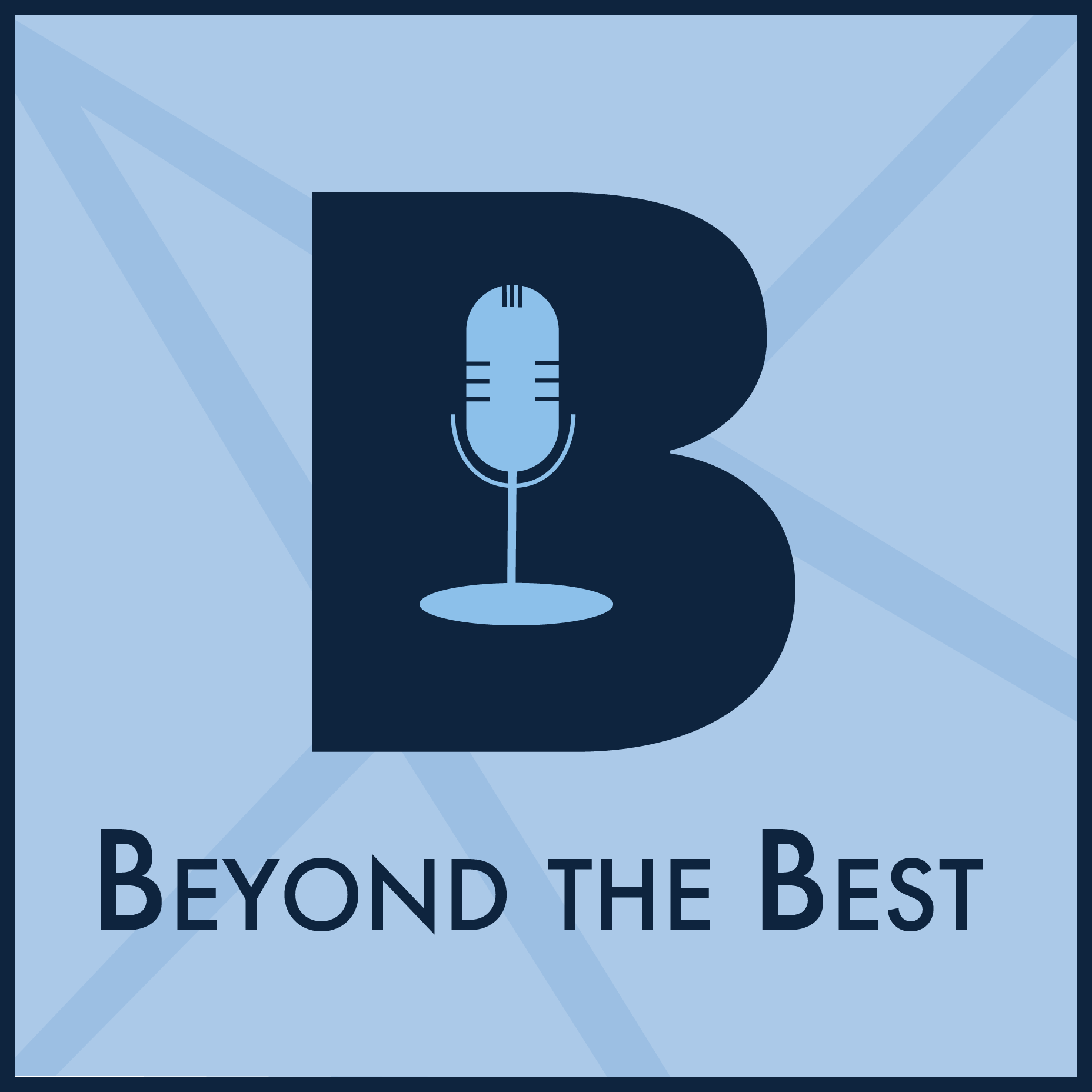
Final Design
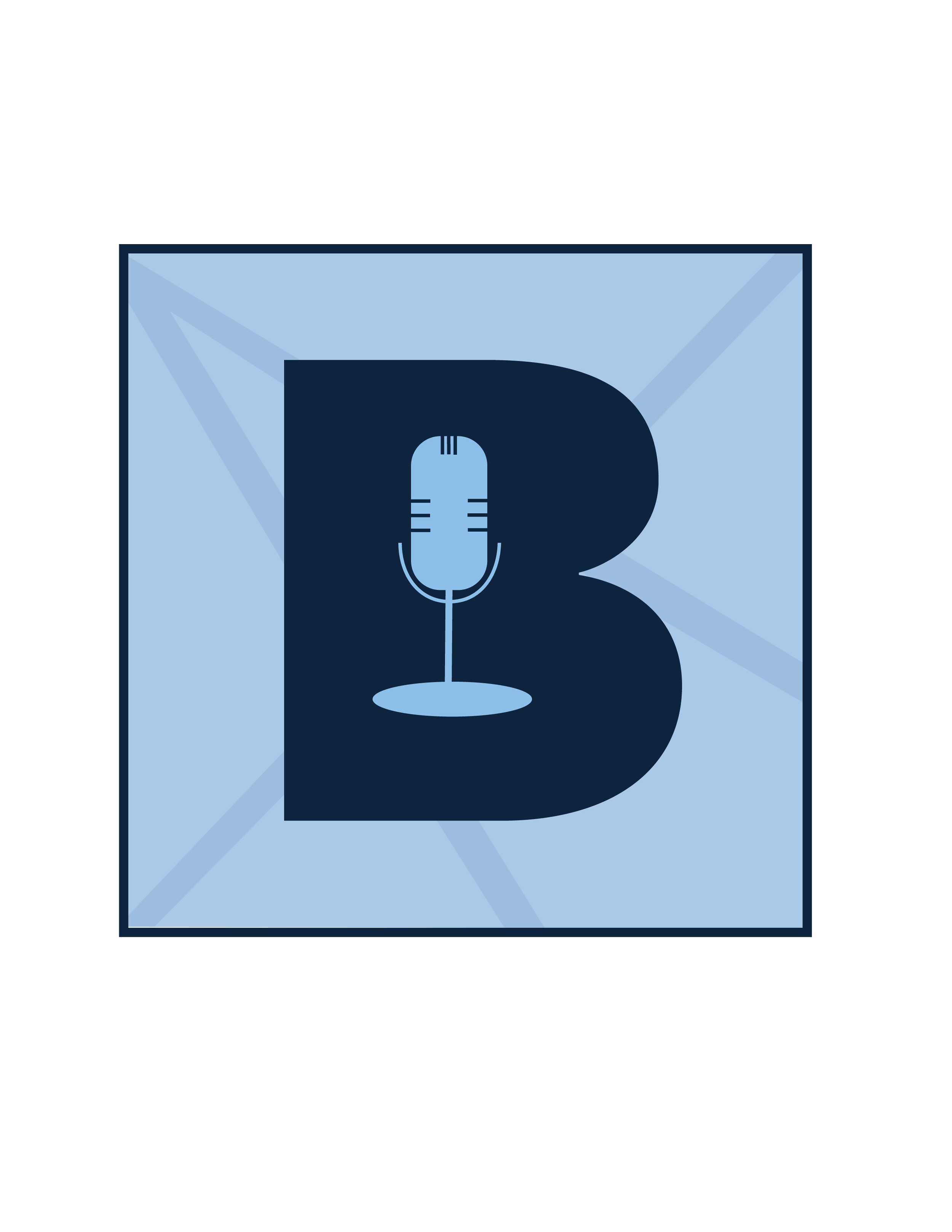
Final Product
The final logo resolves as a bold, integrated mark that balances clarity, function, and brand consistency. The oversized “B” establishes a strong and memorable form, while the embedded microphone ensures immediate recognition as a podcast.
The restrained color palette and consistent typography align seamlessly with The Agency’s identity, positioning the podcast as a natural extension of the brand. The result is a scalable and versatile logo that performs effectively across digital platforms while maintaining a strong conceptual foundation

Outcome
This project reinforced the importance of designing within constraints and using limitation as a tool for clarity. By restricting the visual system to existing brand elements, the focus shifted to form, hierarchy, and integration.
A key takeaway was the value of combining multiple ideas into a single, cohesive mark. The final design demonstrates how identity, function, and symbolism can coexist within a simplified structure when executed with intention.