Spensi
Overview
Role: UX/UIDesigner | Duration: 7 weeks
Spensi is a mobile application designed to support individuals with food allergies while traveling internationally. The app addresses the challenges of communicating dietary restrictions across language barriers, understanding unfamiliar cuisines, and responding to emergencies in high-risk situations.
I led the entire design process end-to-end. I was responsible for UX research, product strategy, information architecture, UI design, and full brand development, including the app’s visual identity and logo.
This project explores how thoughtful UX design can reduce anxiety, improve trust, and enable safer decision-making in moments where clarity is critical.
Research Process
To better understand user needs, I conducted interviews with individuals who have food allergies and experience traveling internationally. These conversations provided insight into both behavioral patterns and emotional responses. A key finding was that trust is the primary barrier, users do not feel confident relying on generic translation tools for something as serious as an allergy. Even when translations are technically correct, uncertainty creates hesitation and stress.
Another important insight was the role of anxiety in shaping behavior. Many users avoid trying new foods altogether, not because they want to, but because they do not feel safe. Speed and simplicity also emerged as critical factors. In real-world scenarios, users need information immediately, without navigating complex interfaces or processing too many options. Additionally, offline functionality was identified as essential, as travelers cannot rely on consistent access to Wi-Fi. These insights helped define the core direction of the product and reinforced the importance of designing for clarity and reliability.
User Personas
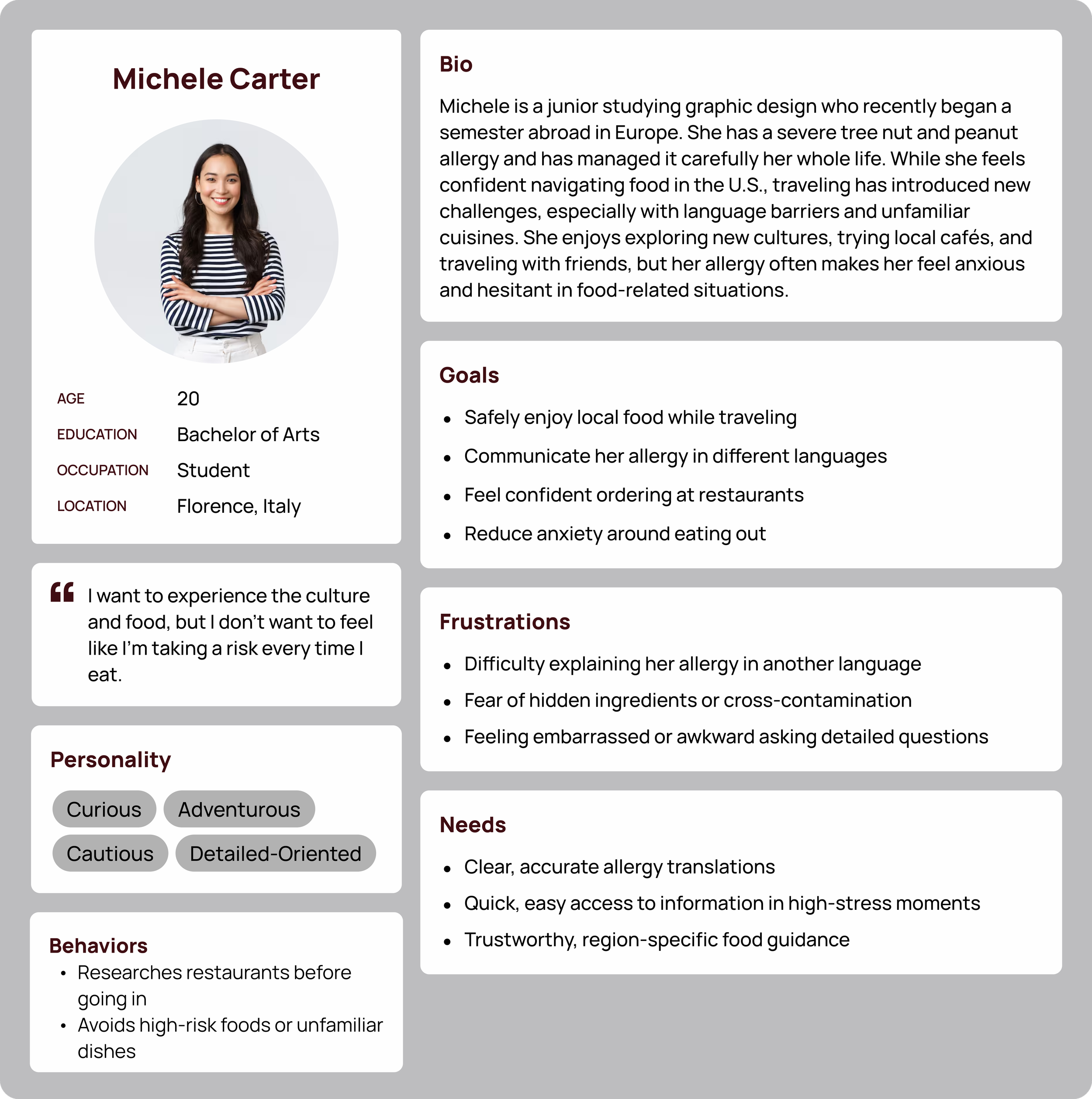
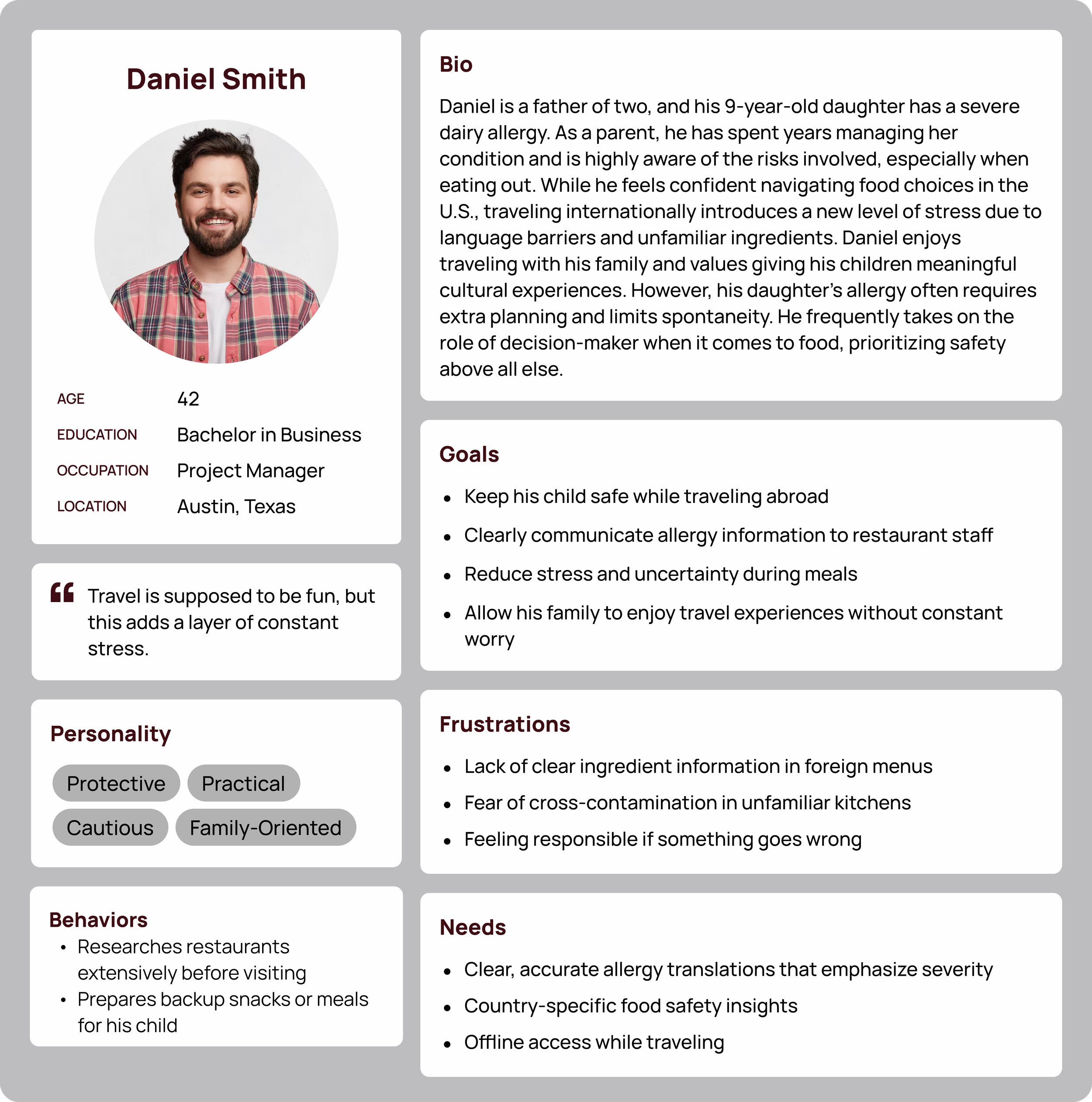
To ground the research, I developed two personas, Michele Carter and Daniel Smith. Designing with Michele and Daniel in mind ensured that decisions remained focused on real user needs, particularly around trust, speed, and ease of use
Michele a college student studying abroad who has a severe nut allergy. Michele represents users who are independent and eager to explore new cultures, but feel held back by the risks associated with their condition. She wants to fully engage in the travel experience, especially when it comes to food, but needs a system that allows her to do so safely and confidently.
Daniel is a father of a child with a severe allergy. He represents parents who want to provide meaningful travel experiences for their families while managing constant concerns about safety. He values exploring new places, cultures, and foods with his children, but traveling introduces a level of uncertainty that makes him more cautious
and protective.
Information Architecture
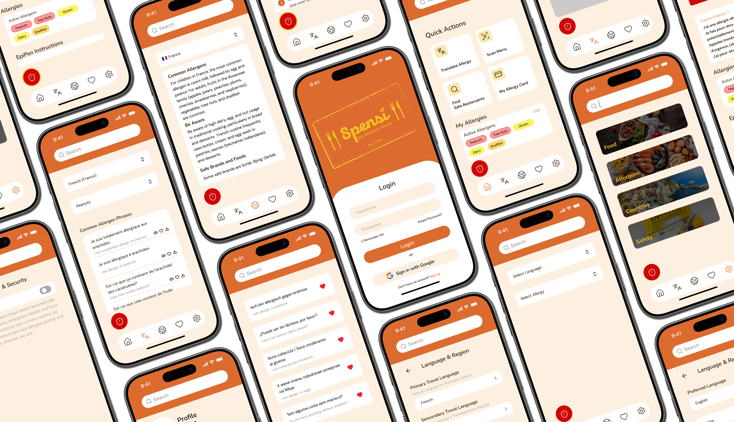
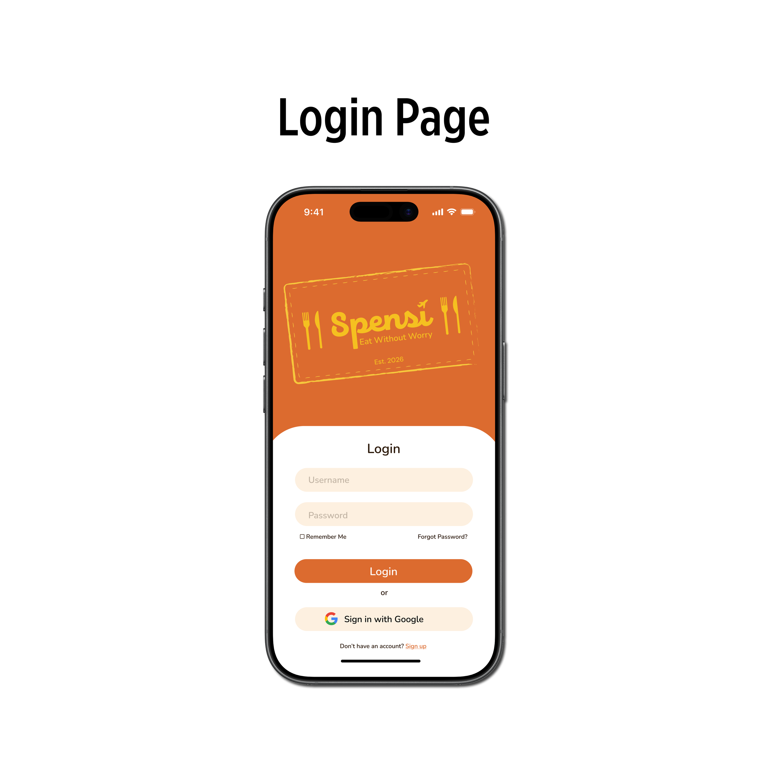
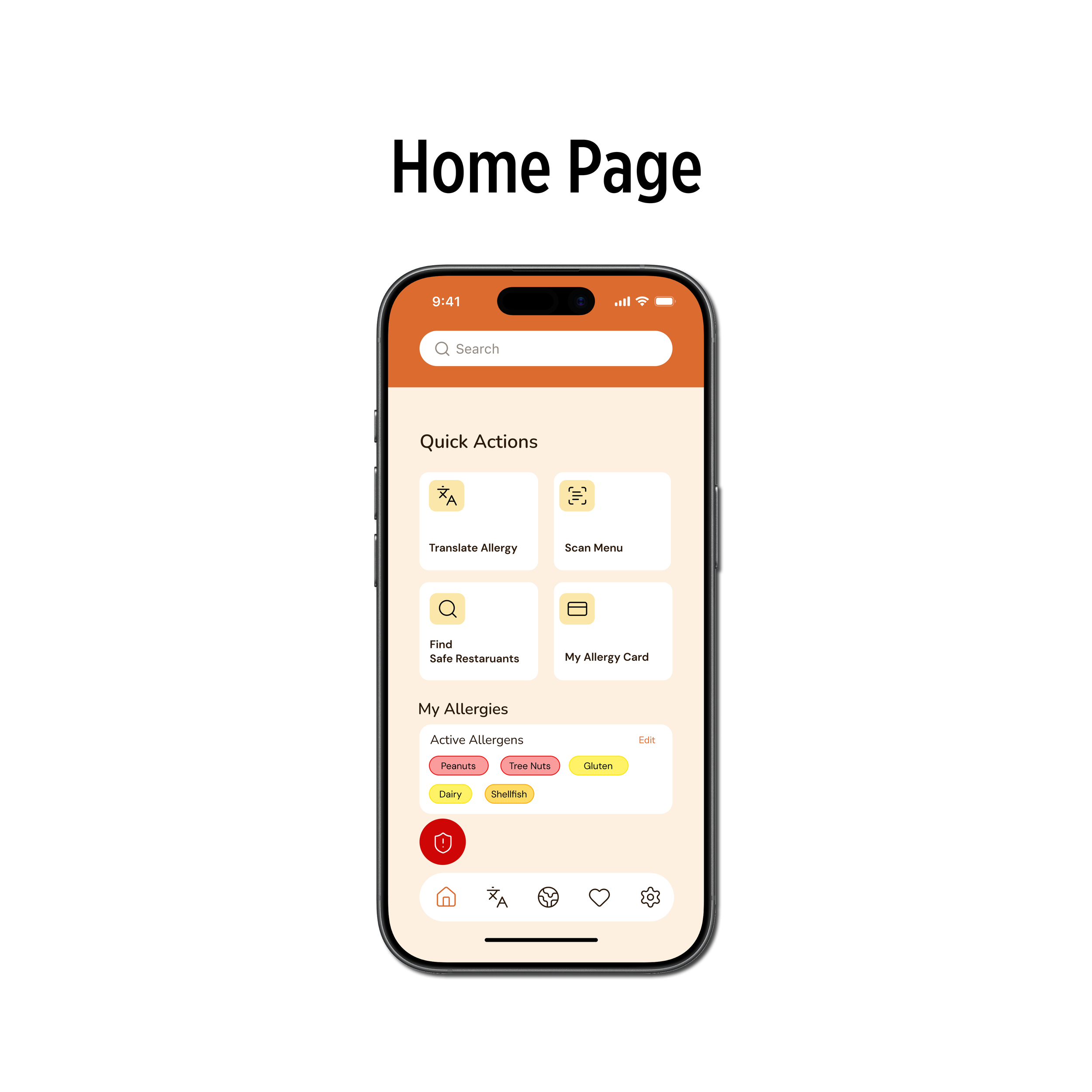
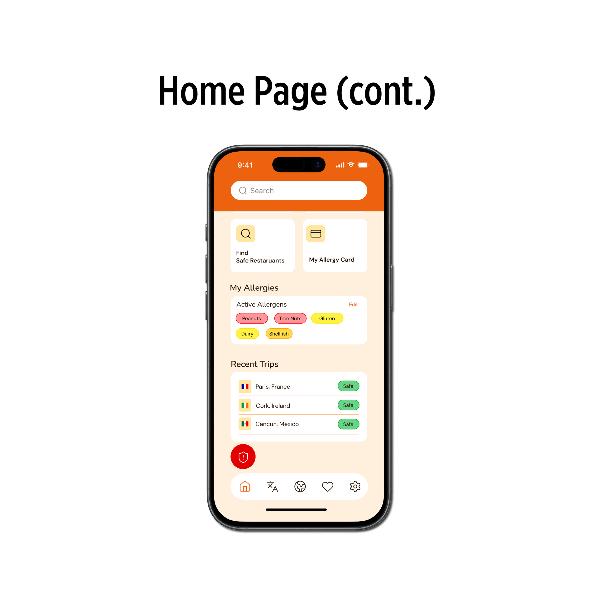
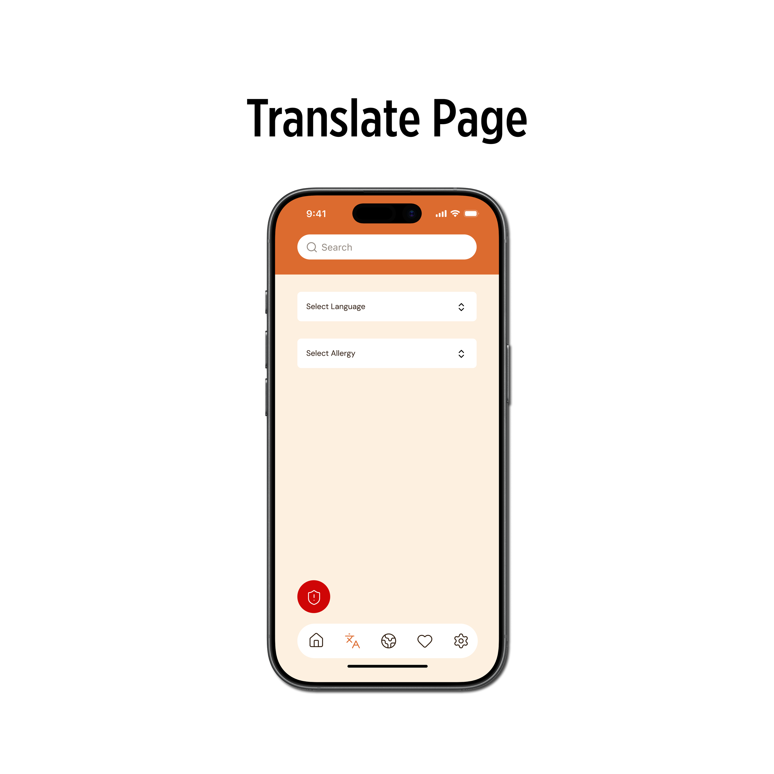
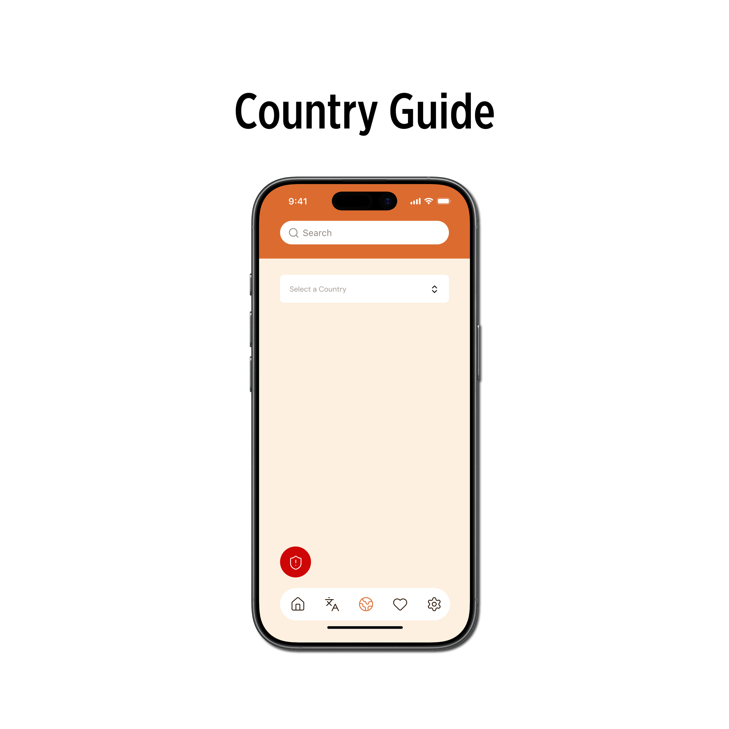
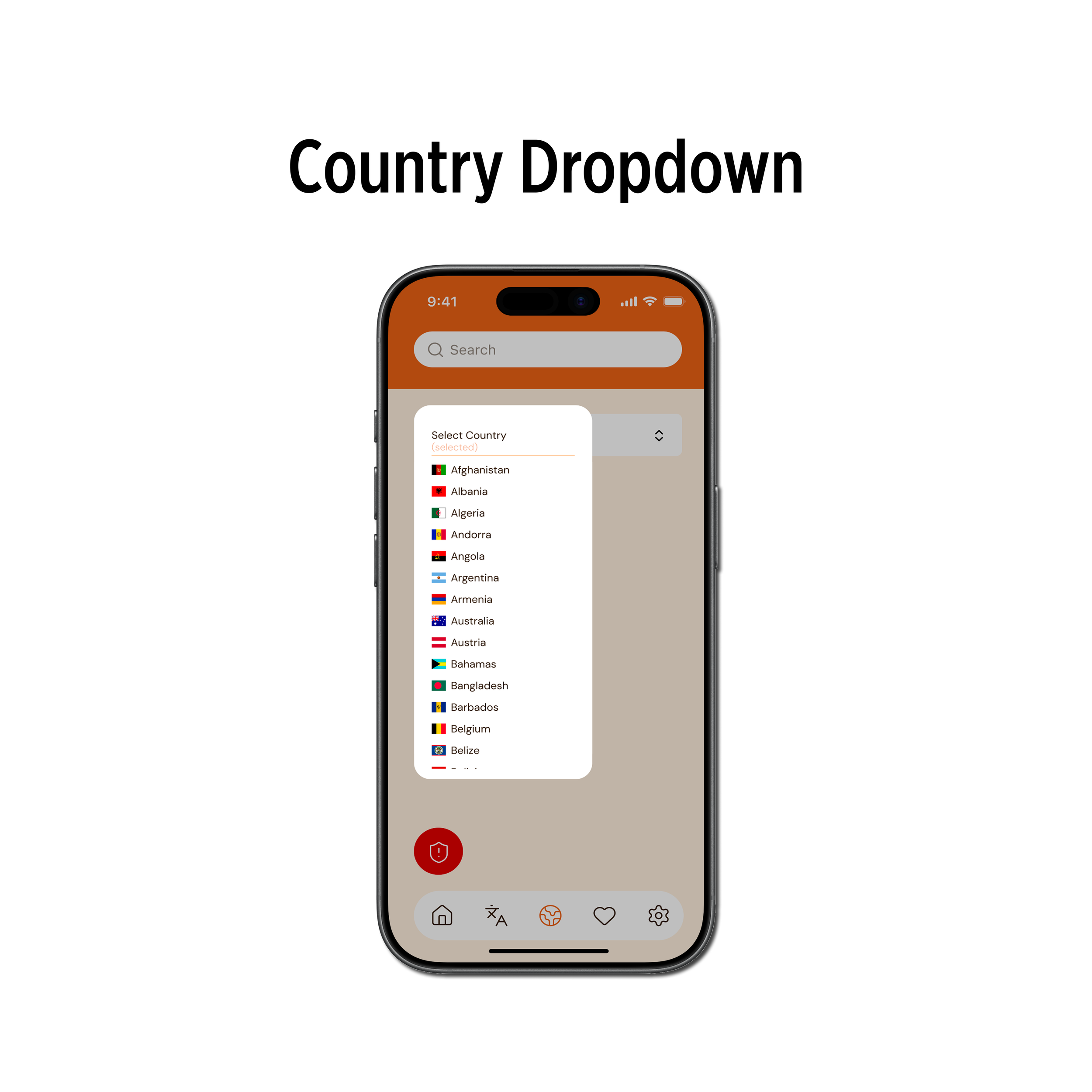
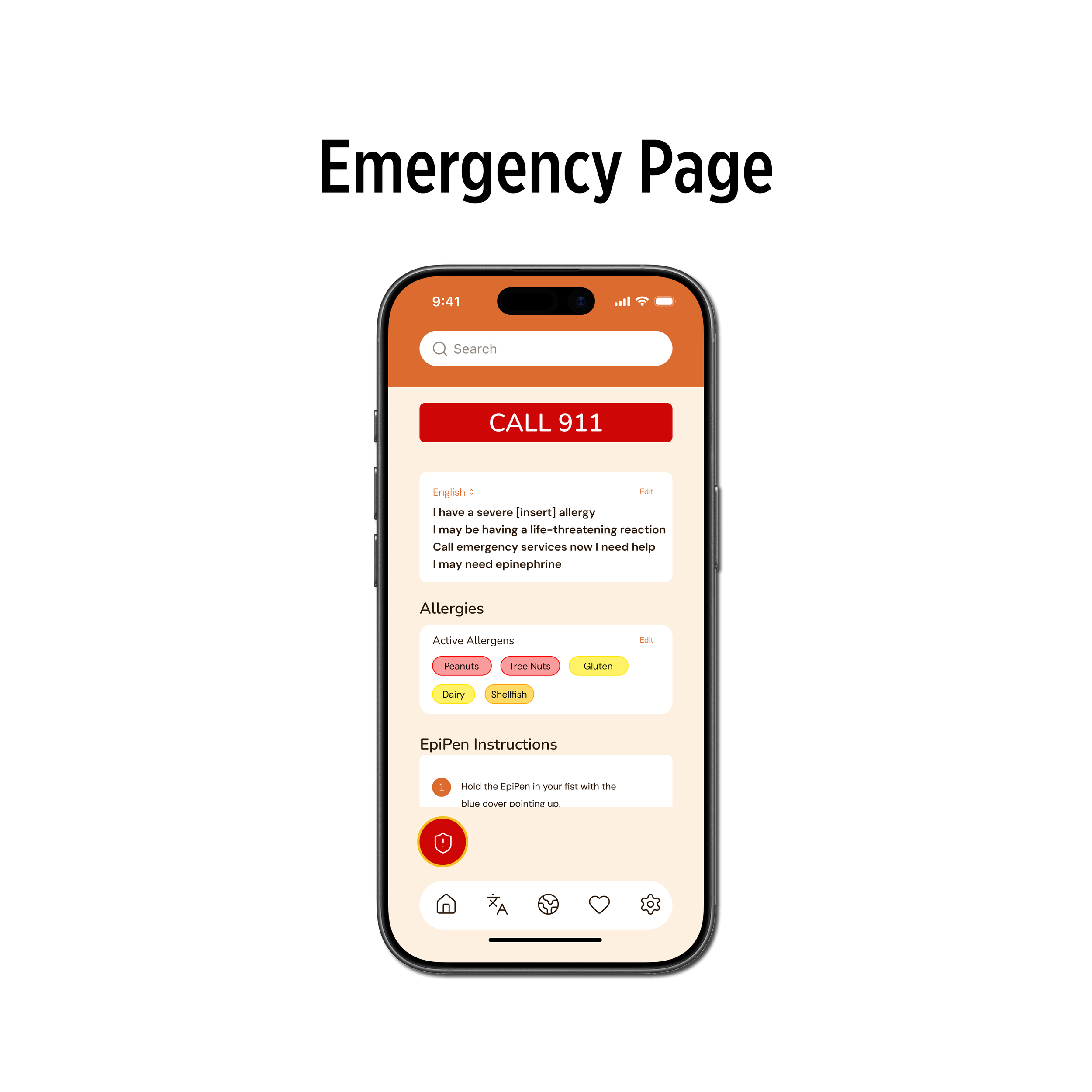
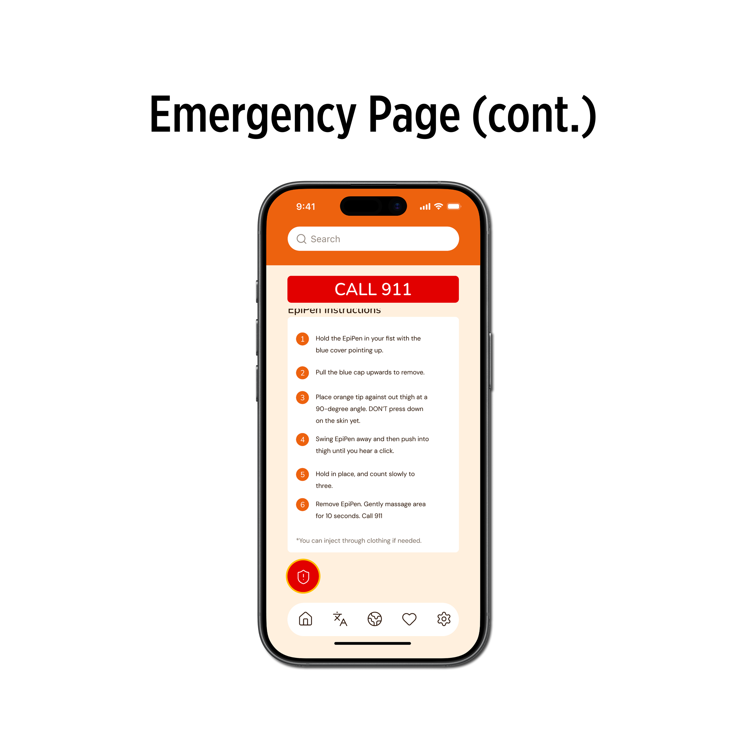
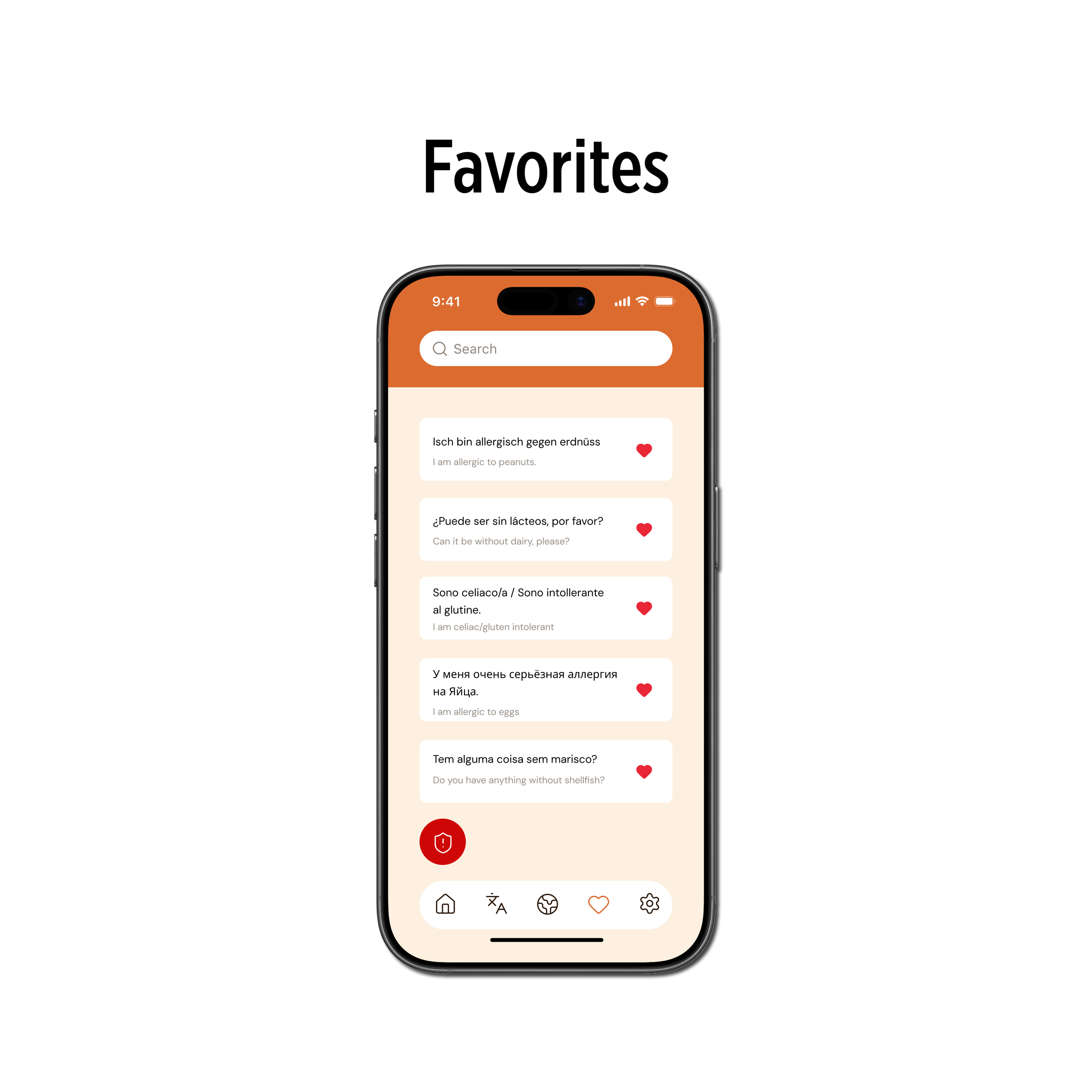
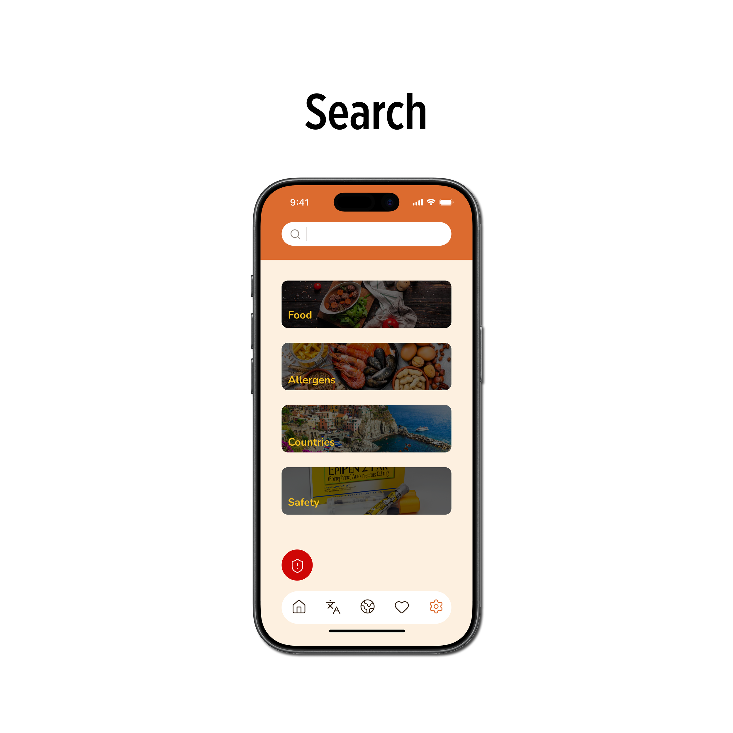
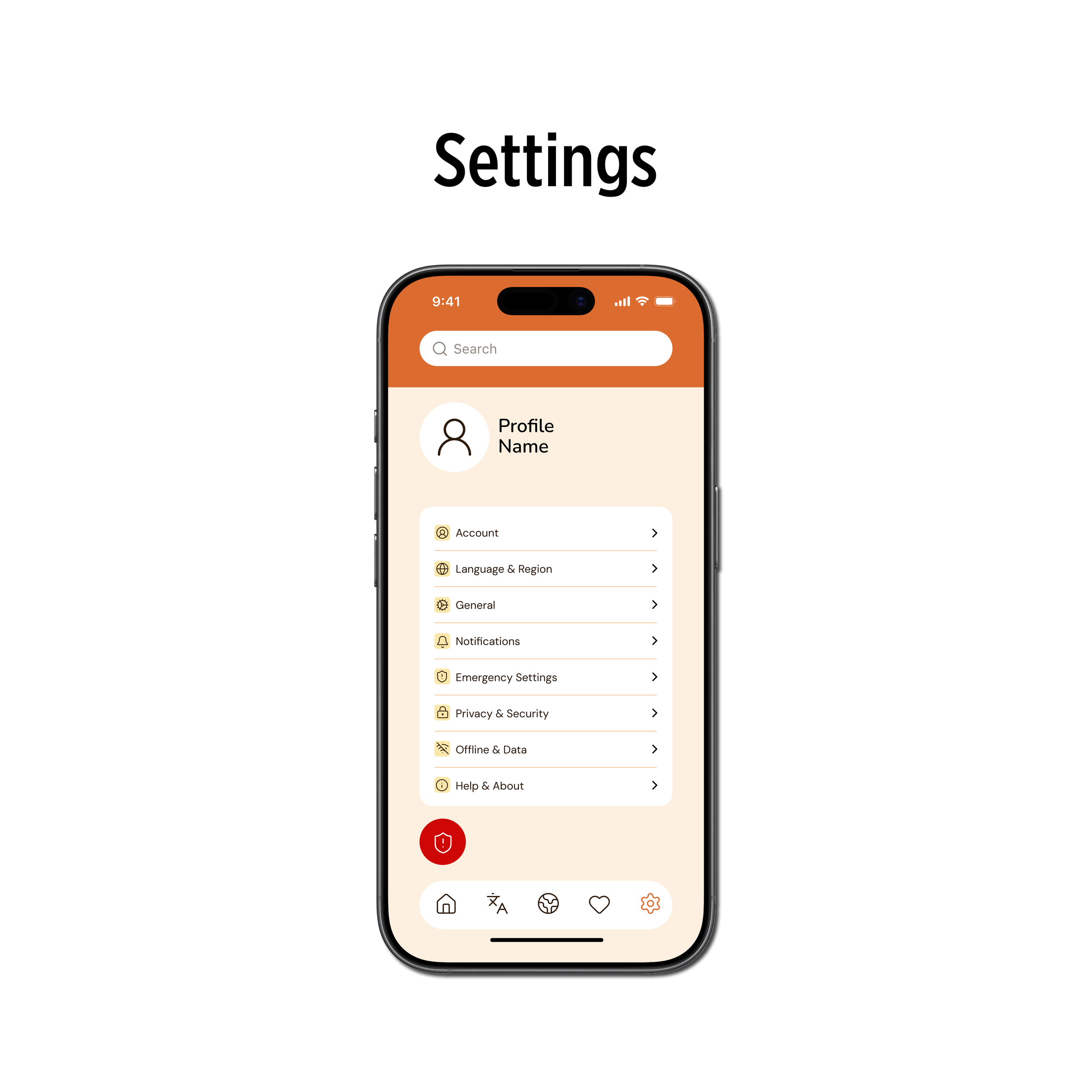
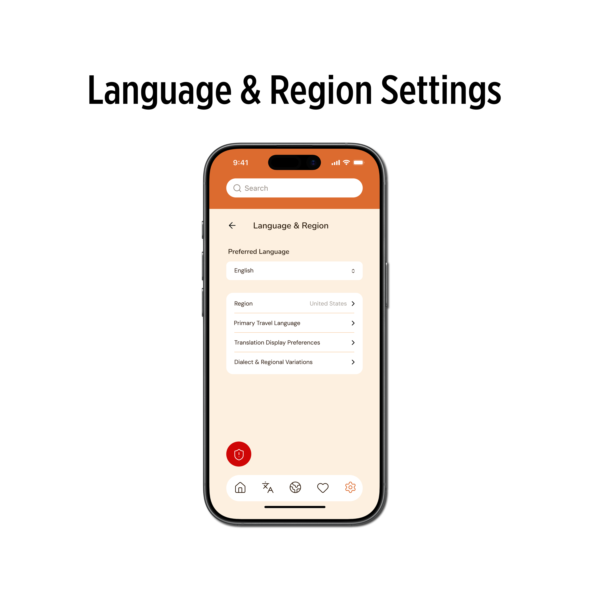
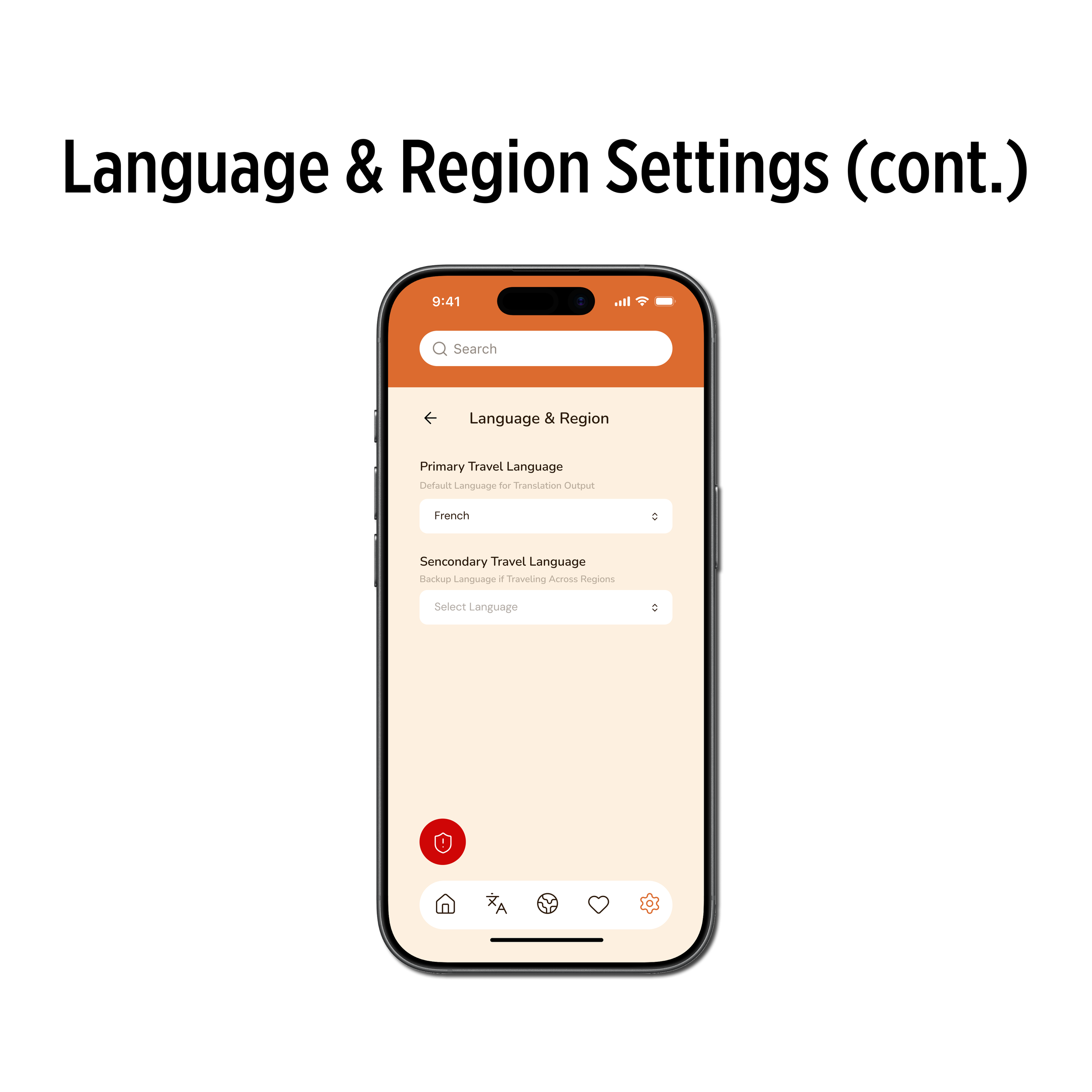
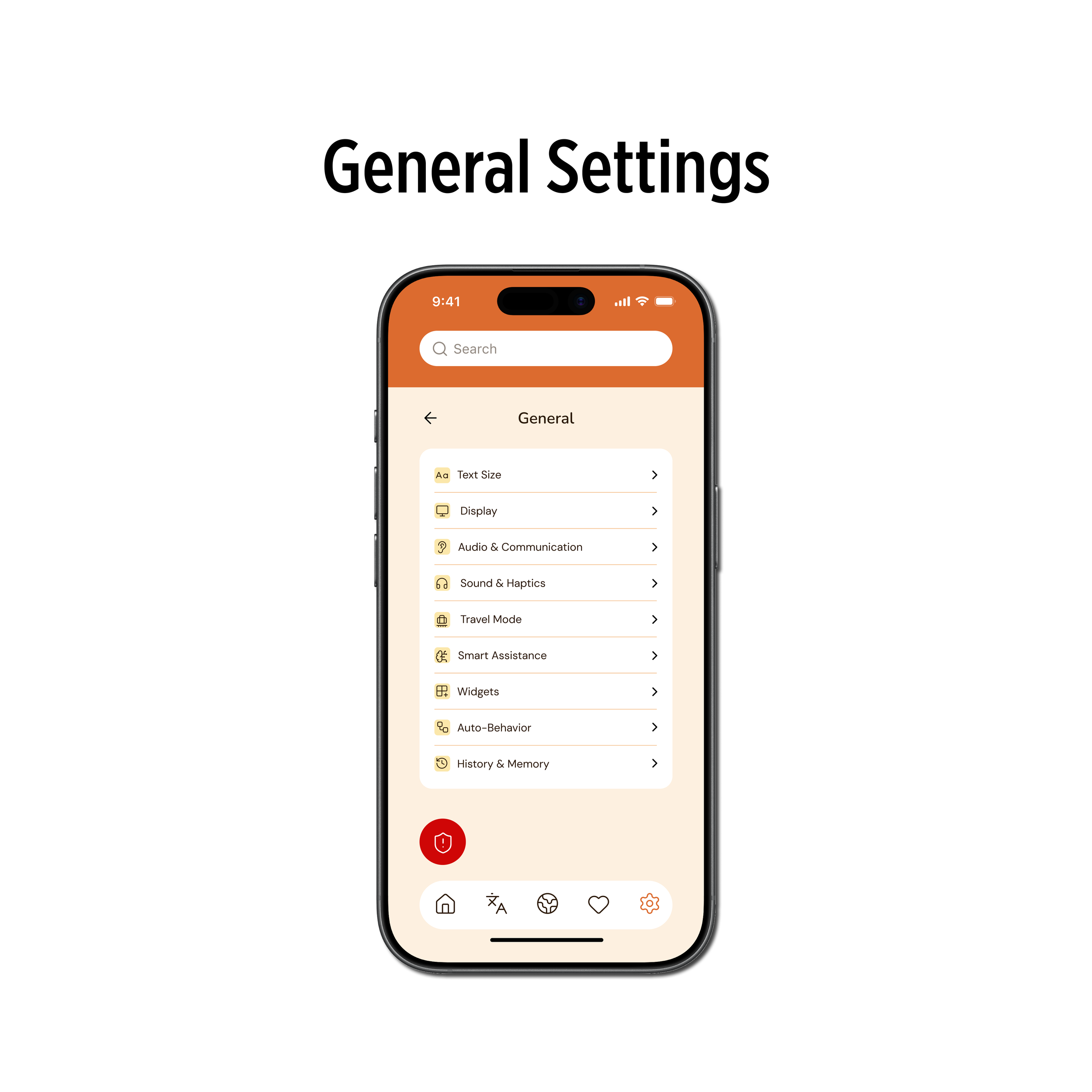
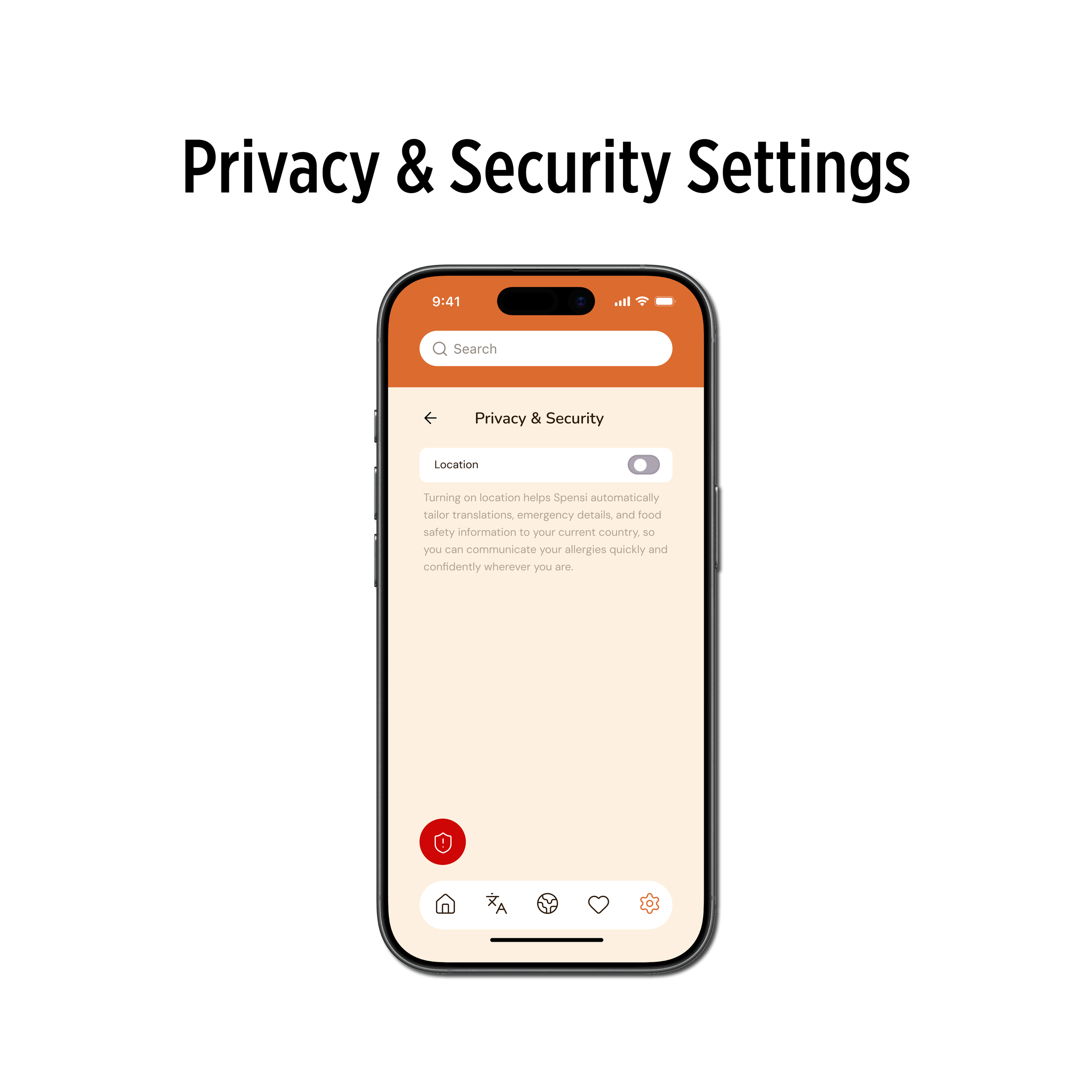
The information architecture of Spensi was designed to prioritize speed, clarity, and ease of navigation. The primary structure includes translation, country guides, emergency mode, saved items, and profile settings.
This organization ensures that the most critical actions are always easily accessible without requiring users to search or think through complex navigation paths. By simplifying the structure and focusing on key tasks, the app reduces cognitive load and allows users to quickly find what they need in high-pressure situations.
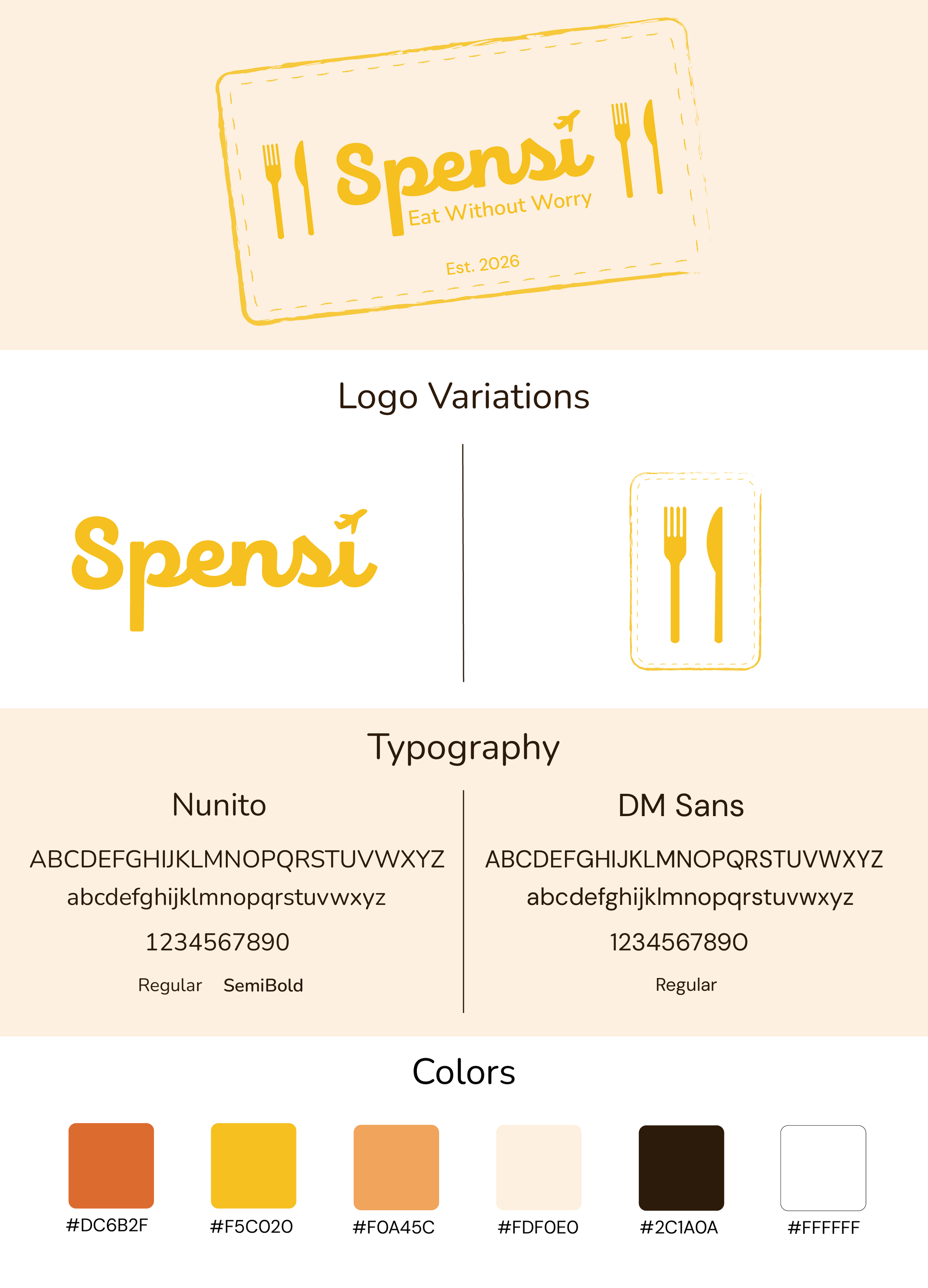
Branding & Identity
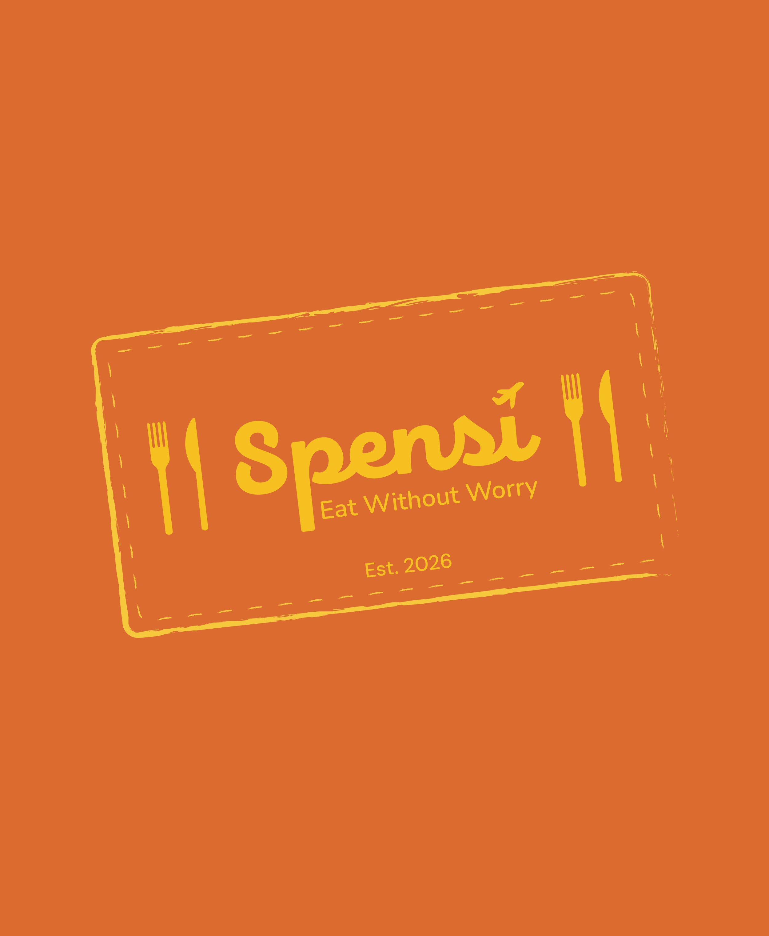
In addition to the product design, I developed the full brand identity for Spensi. The visual system was designed to feel calm, reliable, and approachable, reinforcing the app’s role as a safety tool. The logo and overall branding emphasize clarity and simplicity, ensuring that the identity supports the user experience rather than distracting from it. By aligning the branding with the app’s core values of trust and usability, the overall product feels cohesive and intentional.
A key inspiration for the brand identity came from the concept of a passport stamp. Passport stamps symbolize travel, movement between countries, and official verification, which directly connects to the app’s purpose of helping users navigate international environments safely. I incorporated this idea into the logo and overall visual language by creating a mark that feels structured, contained, and recognizable, similar to the way a stamp functions. This not only reinforces the travel aspect of the app, but also subtly communicates a sense of authority and trust, as if the information being presented is “approved” and reliable.
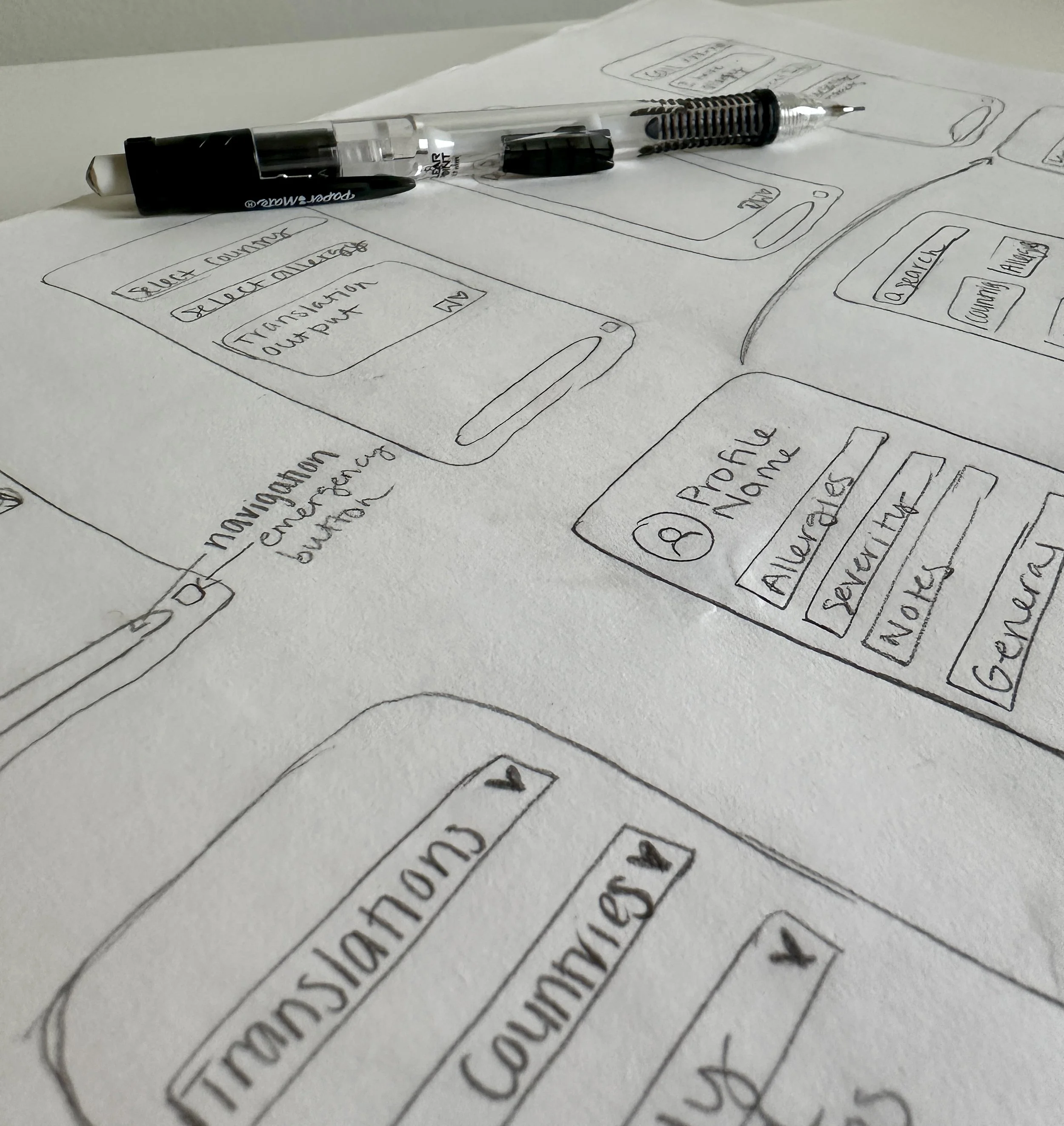
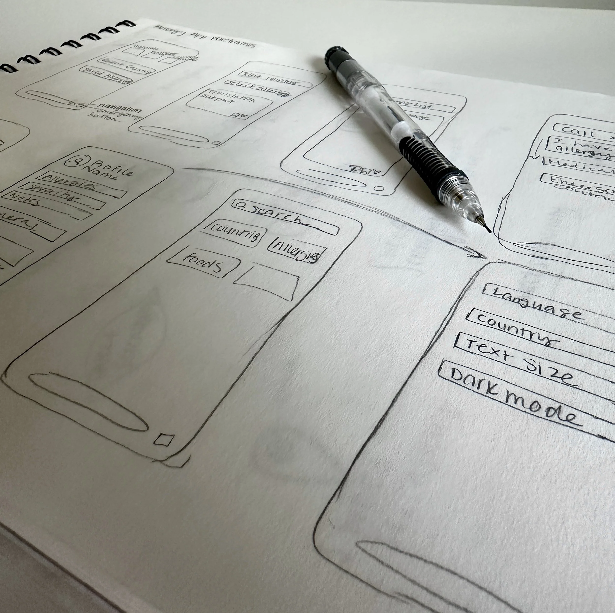
Ideation & Sketches
I created a series of low-fidelity wireframe sketches to explore layout, structure, and user flow before moving into digital design. These sketches allowed me to quickly iterate on ideas and focus on functionality without being distracted by visual styling. At this stage, the goal was to determine how users would navigate the app and access critical features as efficiently as possible.
Digital Design & Iteration
After establishing the structure through wireframe sketches, I moved into digital design, where I translated initial concepts into more refined, high-fidelity screens. Using Figma, I began building out the interface with a focus on visual hierarchy, usability, and consistency across the app.
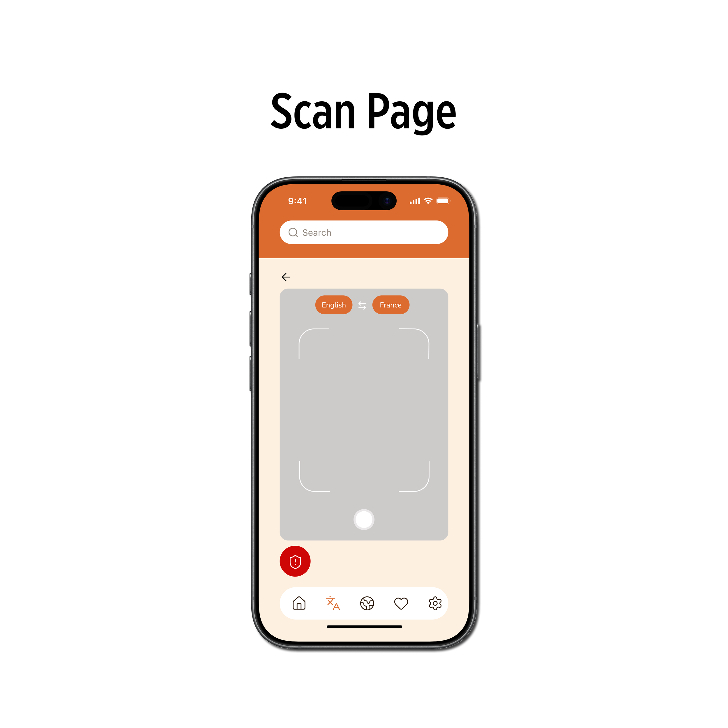
I created multiple versions of key screens, particularly the translation interface and emergency mode, to test different approaches to layout and information prioritization. Early iterations revealed areas where the interface felt too complex or where important actions were not immediately clear. In response, I simplified navigation, reduced the number of on-screen options, and emphasized primary actions through stronger visual hierarchy.
Final Product
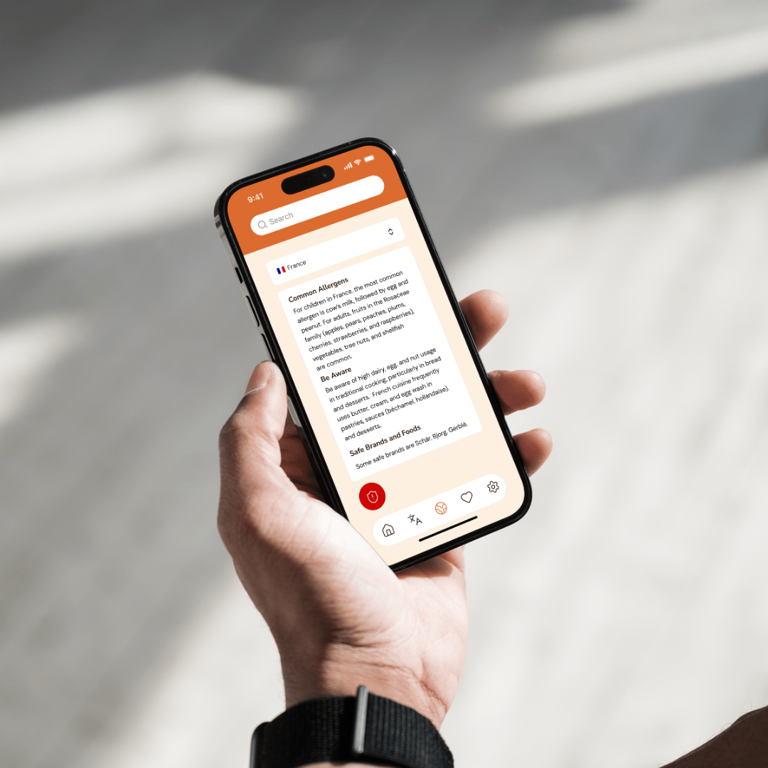
The final product is a high-fidelity, interactive prototype of Spensi that demonstrates a complete, user-centered solution for navigating food allergies while traveling. The app brings together translation, education, and emergency support into a cohesive experience designed specifically for high-stress, real-world situations. Every feature and interaction was informed by user research and built with a focus on clarity, speed, and trust.
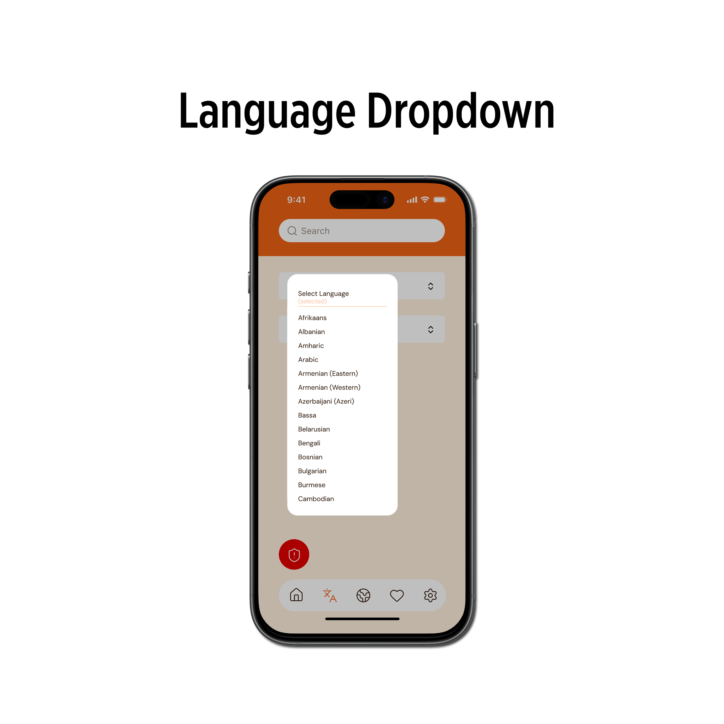
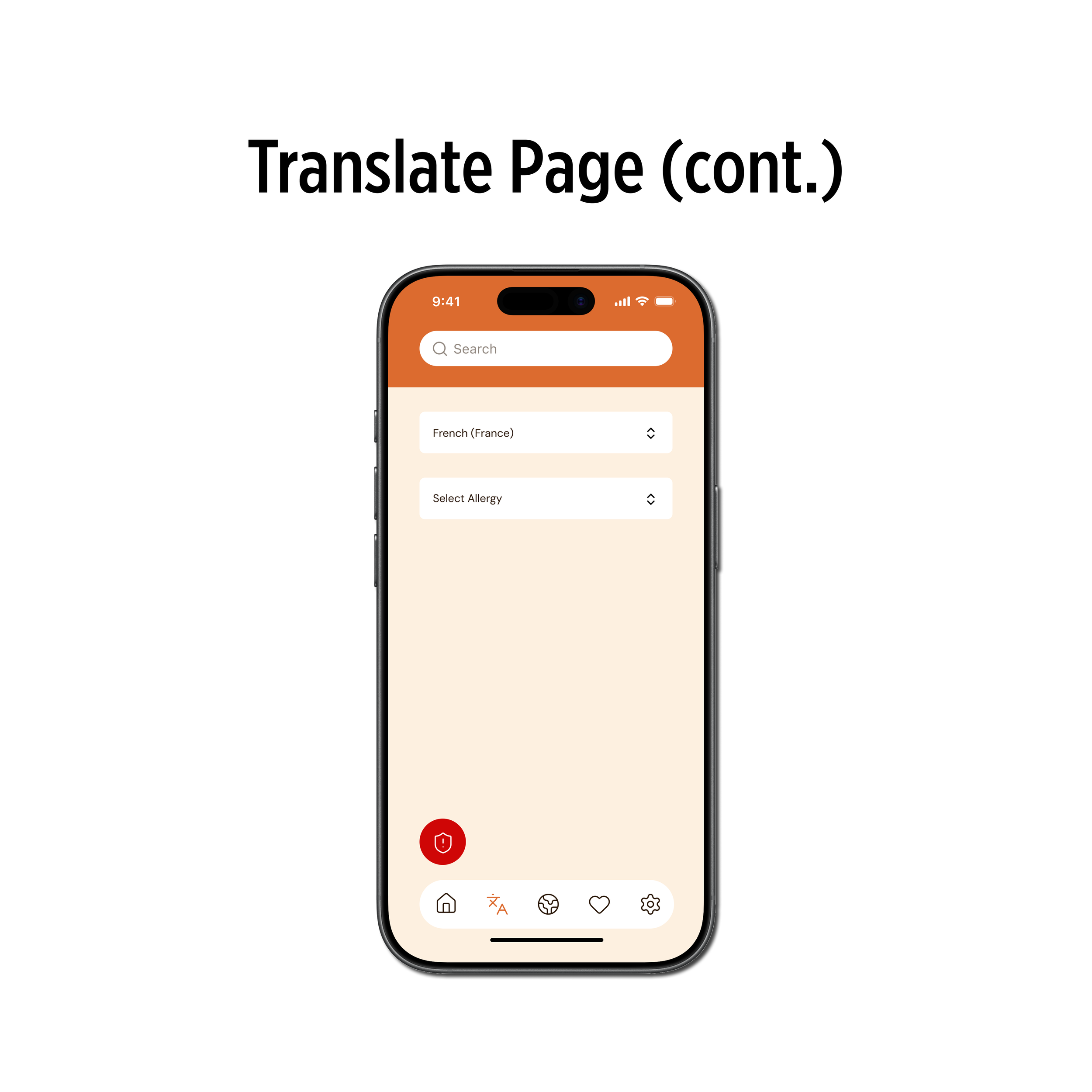
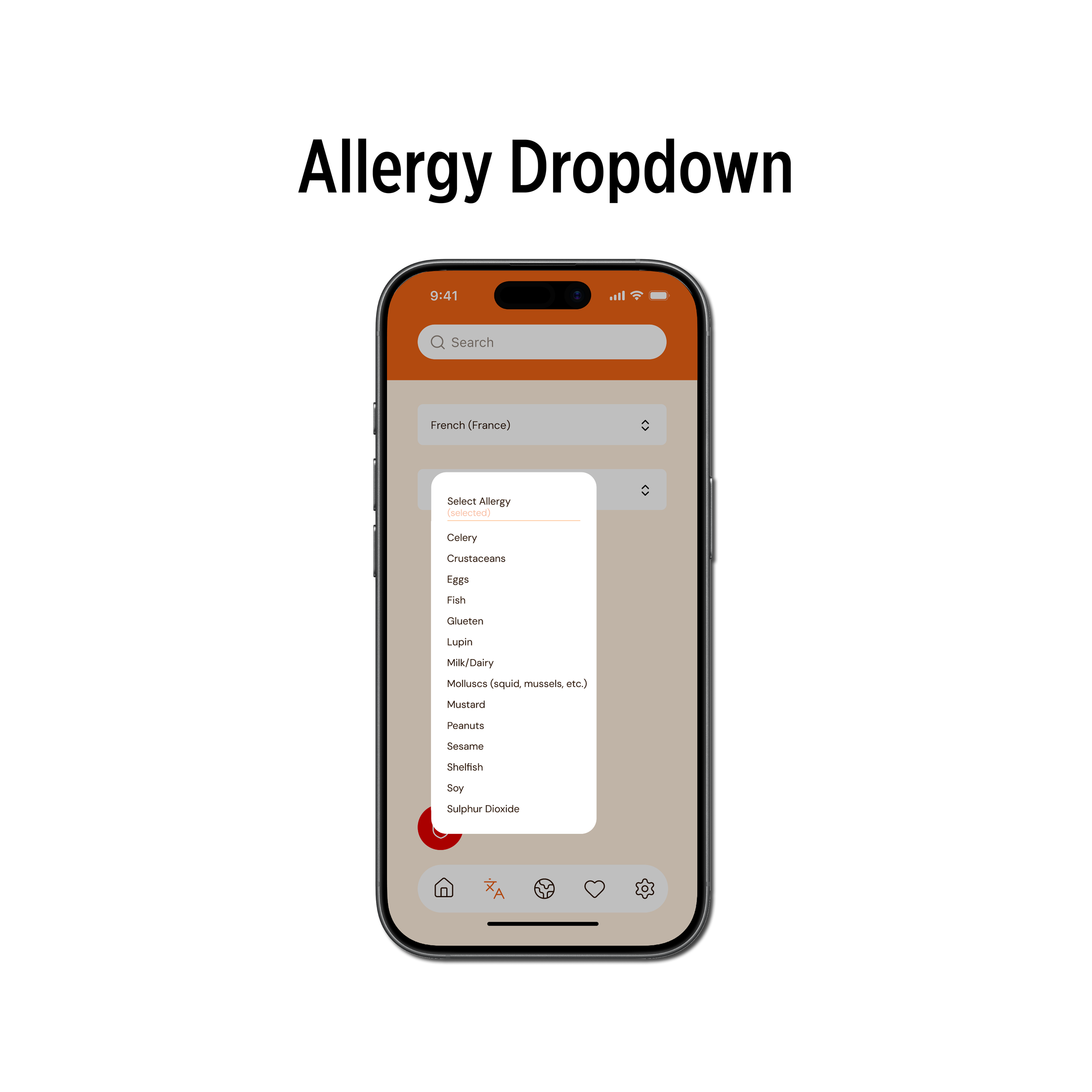
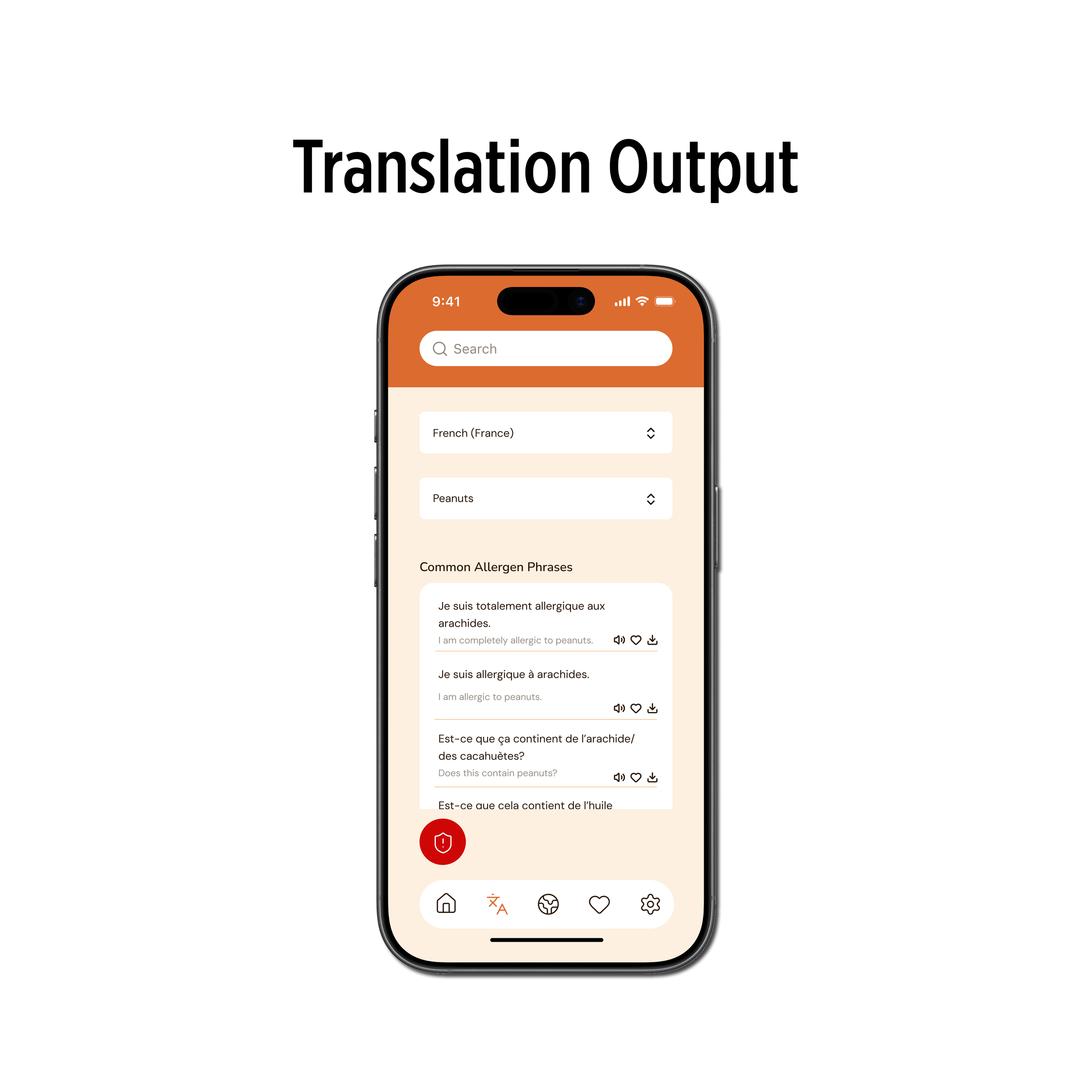
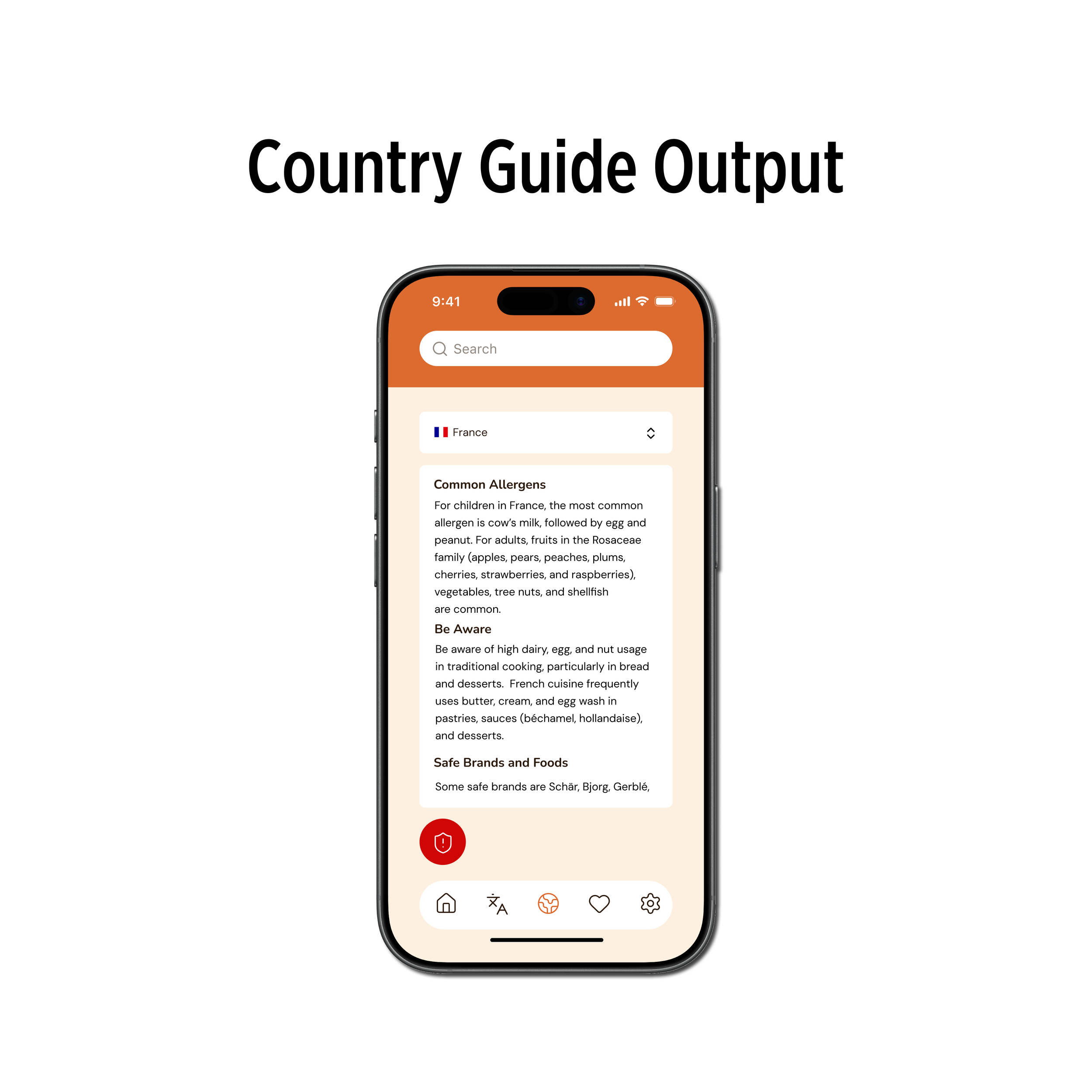
The core functionality of the app centers around three primary areas: allergy translation, country-specific guidance, and emergency support. Users can quickly generate clear, pre-written translations of their allergies that are designed to be easily understood by restaurant staff. These translations can be displayed visually or played aloud, allowing users to communicate in the way that feels most effective in the moment. In addition to translation, the app provides country-specific food insights, including common ingredients and high-risk dishes, helping users make more informed decisions before entering a restaurant.
Outcome
Spensi transforms a stressful and uncertain experience into one that feels more manageable and supported. By focusing on clarity, speed, and trust, the app enables users to communicate more effectively and make safer decisions while traveling. It encourages users to engage more confidently with new cultures and environments, without compromising their safety.
This project reinforced the importance of designing for real-world conditions rather than ideal scenarios. It highlighted how simplicity can reduce anxiety and improve usability, and how trust is built through consistency and clarity. Working across both UX and branding also emphasized how visual identity can support functionality, not just aesthetics. Overall, this project challenged me to think more deeply about how design impacts user behavior, especially in high-stakes situations.