Why Good Typography Matters
Typography is such a fundamental part of visual communication. It can make or break your entire design. Making thoughtful typographic choices is an important step in the design process. Before discussing why good typography matters, let’s talk about the difference between bad typography and good typography.
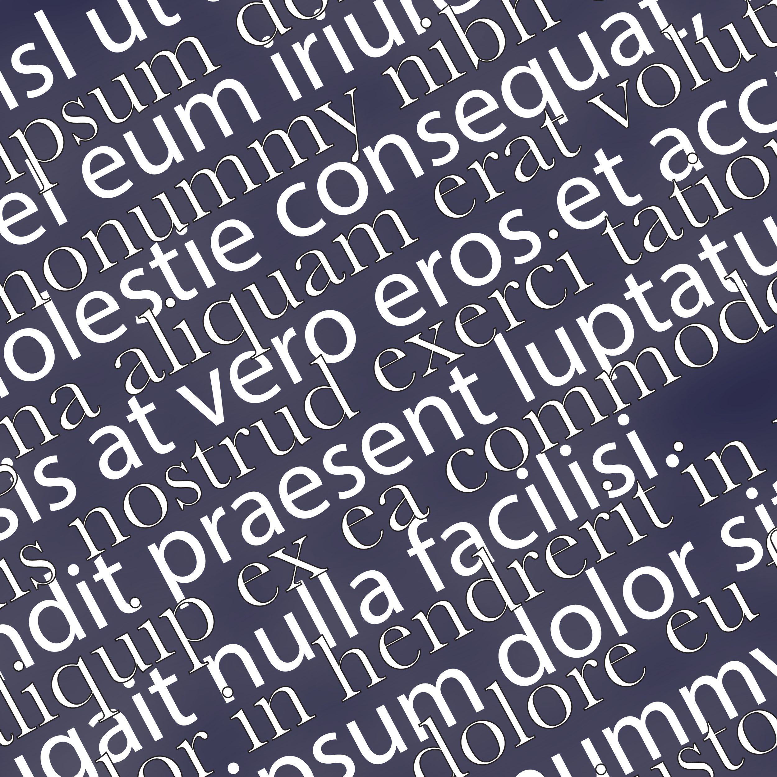
Bad Typography
Bad typography is often characterized by poor readability, weak visual hierarchy, and inconsistent or overly decorative fonts that distract from the message rather than support it.
One common mistake is overusing center-aligned text. While it may look visually appealing in some situations, center alignment can make longer blocks of text difficult to read. Because each line begins at a different point, the reader’s eyes have to work harder to locate the start of the next line.
Another sign of bad typography is using too many fonts within a single design. When several unrelated typefaces are combined without clear hierarchy or intention, they begin to compete for attention. Each font carries its own visual weight and rhythm, and using too many can make a layout feel cluttered and unbalanced.
Poor kerning and tracking can also negatively affect typography. Kerning refers to the spacing between individual letters, while tracking adjusts spacing across a group of letters. Although these details are easy to overlook, improper spacing can make text look awkward and reduce readability.
A lack of hierarchy is another common typographic issue. Hierarchy helps readers understand what information is most important on a page. Without it, text can feel overwhelming and disorganized, making it harder for readers to process the information.
Choosing the wrong typeface can lead to ineffective typography. When a font does not match the tone of the content, the brand, or the medium it is being used in, it can create confusion and weaken the overall message.
Good Typography
Good typography focuses on maximizing readability, reinforcing the message of the text, and creating a comfortable reading experience. It carefully balances font choice, size, contrast, and spacing to produce a clear and organized layout.
One important element of good typography is readability and hierarchy. Designers use variations in font size, weight, spacing, and placement to guide the reader through the content and highlight the most important information. A clear hierarchy allows readers to quickly understand how the information is structured and where their attention should go first.
Consistency and proper spacing are also key aspects of strong typography. Using a limited number of fonts and maintaining consistent alignment helps create a cohesive and professional design. Proper spacing between letters, words, and lines improves legibility and prevents text from appearing cluttered. When typography is used effectively, it not only improves readability but also strengthens the overall visual identity of a design.
Why It Matters
Good typography plays a significant role in making content engaging, readable, and visually appealing. When typography is thoughtfully designed, it helps audiences absorb information more easily and improves the overall user experience.
One reason typography matters is that it improves readability. Clear and legible typefaces, combined with appropriate spacing and sizing, allow readers to process information quickly and with minimal effort.
Typography can also influence emotion and tone. Different typefaces communicate different feelings. Some may appear professional and sophisticated, while others feel playful or friendly. Choosing the right font helps reinforce the message and creates a stronger emotional connection with the audience.
Typography plays an important role in shaping a brand’s identity. Consistent typographic choices across websites, advertisements, and other materials help create a recognizable and cohesive visual presence. When used effectively, typography becomes a powerful tool that strengthens communication and helps brands stand out.
Final Thoughts
Typography is more than just selecting a font. It is about creating a clear and engaging experience. By focusing on readability, hierarchy, consistency, and appropriate font choices, we can use typography as a powerful tool to support both the message and the visual identity of their work. One of the reasons I love it so much is because it can be powerful, and without good typography, then what is the point.

Hi I’m Rebecca Collins, and I am a graphic designer with a strong interest in branding, typography, and visual storytelling.
I love exploring how design can shape the way people experience information, whether through print, digital media, or motion.