Designing Emotion: The Role of Typography in Mood
Typography is one of the most powerful and often underestimated tools in a designer’s toolkit. As mentioned earlier, typography plays a major role in shaping mood. Different typefaces carry different emotional tones, which means the fonts you choose can completely change how your message is perceived. Typography is not just a way to display words. It is an emotional signal that speaks directly to the subconscious.
Font Psychology
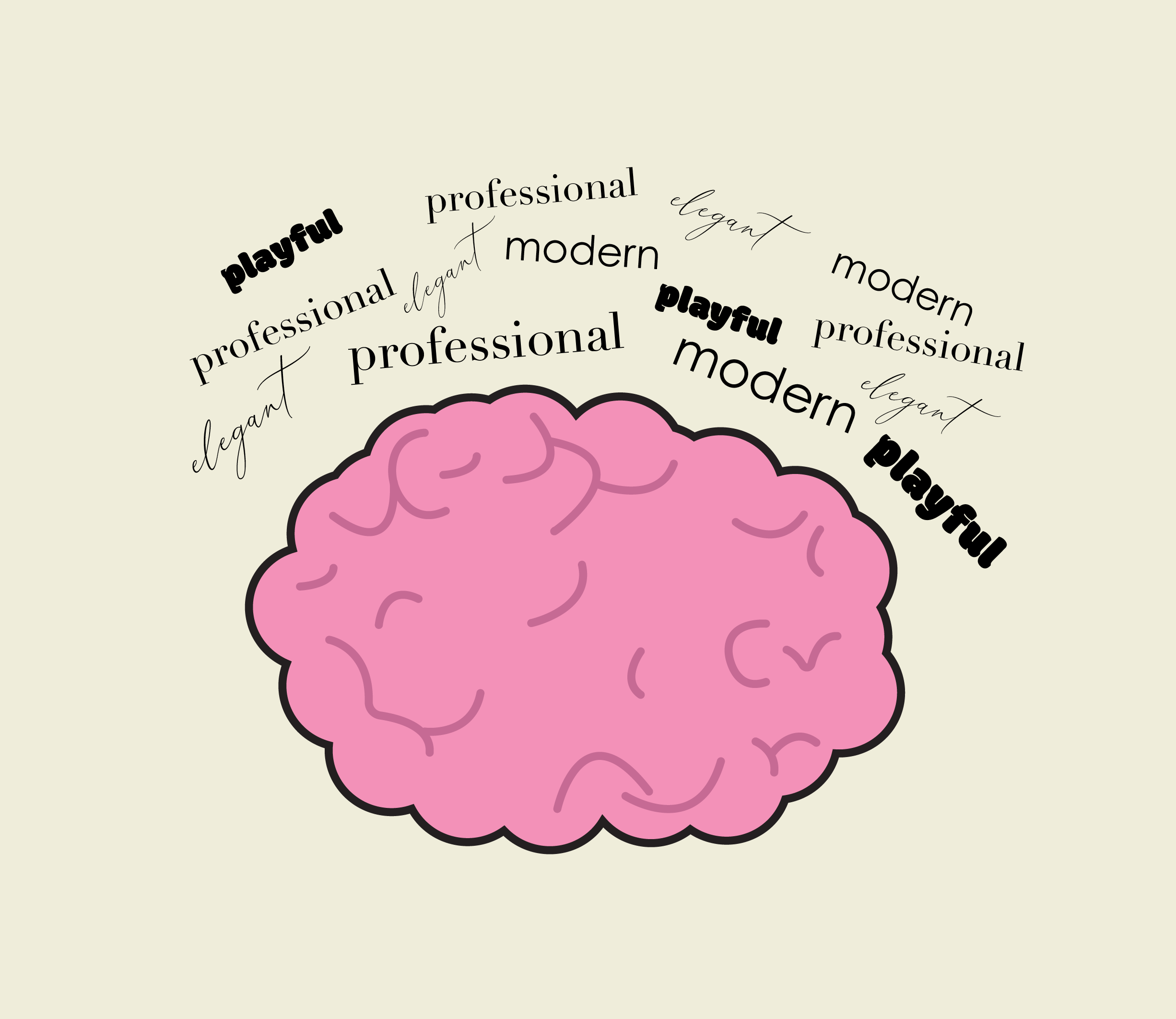
Font psychology is the study of how different fonts and typographic styles influence the thoughts, feelings, and behaviors of viewers. Fonts can trigger emotional responses both consciously and subconsciously, meaning people are reacting to your design before they even realize it. For example, a bold, heavy font often feels strong and powerful, while a thin, light font can feel soft and delicate.
Different categories of fonts also carry distinct moods. Serif fonts are often associated with tradition, trust, and professionalism, which is why they are commonly used in academic or formal settings. Sans-serif fonts tend to feel modern, clean, and straightforward, making them popular for digital platforms and tech companies. Script fonts can feel elegant or romantic, while decorative fonts are often seen as creative and expressive.
One example of this is an album covers. The typeface should reflect the essence of the music while also being clear and legible. Sharp and angular fonts, that signify intensity, are usually associated with metal or hard rock. Handwritten or script styles feel mor personal and are commonly linked to folk or indie genres. Strong contrast and thoughtful hierarchy ensure that the design is not only expressive, but readable.
These subtle differences play a huge role in setting the tone of a design. When your font choice aligns with your message and evokes the right emotional response, your design becomes much more effective. Typography is not just a stylistic decision. It is a strategic one.
Branding
This connection between typography and emotion is something brands use all the time. Companies carefully choose fonts that reflect their identity and help them connect with their audience. A luxury brand, for example, might use a refined serif typeface to communicate sophistication, while a children’s brand may use a rounded, playful font to feel more approachable and fun.
Typography also works closely with layout and spacing to shape the overall mood of a design. It’s not just about what font you choose, but how you use it. Elements like font size, weight, spacing, and hierarchy all affect how comfortable a design feels to read. Poor spacing and cluttered text can create frustration, while clean, well-organized typography creates a more enjoyable and engaging experience. Even small adjustments can shift a design from feeling overwhelming to calm and easy to navigate.
Final Thoughts
Typography is one of the most powerful tools a designer has for shaping perception. The right font can communicate emotion, strengthen a message, and make a design more memorable. When used intentionally, typography doesn’t just support a design, it defines it.
The next time you are working on a design pay attention to how your type feels and not just how it looks. In design, the difference between good and great comes down to the details, and typography is one of the most important ones.

Hi I’m Rebecca Collins, and I am a graphic designer with a strong interest in branding, typography, and visual storytelling.
I love exploring how design can shape the way people experience information, whether through print, digital media, or motion.