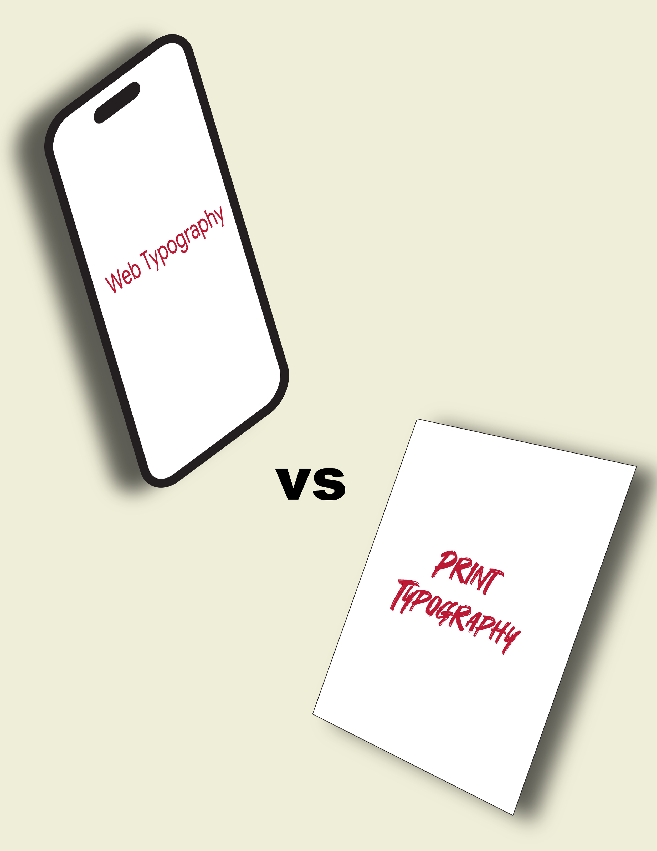
Web Typography vs. Print Typography
As we have already established, typography is everywhere. It shapes how we read, interpret, and emotionally connect with content. But have you ever stopped to consider the difference between print typography and web typography? While they share the same foundational principles, they operate in very different environments, and those environments change everything.
Print Typography
Print typography is the art and technique of arranging type to make written language readable, legible, and visually compelling in physical materials. It plays a critical role in shaping brand perception, establishing tone, and guiding the reader’s experience. Because print exists in a controlled, static format, designers have full authority over how type appears.
You’ll find print typography in books, magazines, brochures, posters, packaging, and instruction manuals. Once something is printed, the designer’s choices, the typeface, size, spacing, and color, are fixed. Every reader sees the same result. This consistency allows for greater precision and often more creative freedom.
Web Typography
Web typography is the art and technique of arranging type for digital screens. While it shares the same goal of readability and visual appeal, it must also account for accessibility, responsiveness, and varying user behaviors.
Unlike print, web typography lives in a dynamic environment. It must adapt to different screen sizes, resolutions, browsers, and operating systems. Designers also have to consider shorter attention spans, skimmability, and user interaction. The experience is not fixed, users can scroll, zoom, resize text, or switch devices entirely.
Key Differences
1. Serif vs. Sans-Serif Traditionally, serif typefaces have been favored in print because the small strokes at the ends of letters can help guide the eye across long passages of text. On screens, however, sans-serif fonts have been preferred due to clarity at lower resolutions. Even though modern displays have improved serif legibility online, web typography still prioritizes simplicity.
2. Control and Consistency Print offers complete control. What you design is exactly what appears on paper. Web typography, however, can vary depending on browser rendering, device settings, and user preferences. Designers must work within technical constraints and ensure fonts load properly and display consistently.
3. Type Size and Flexibility In print, selecting the correct type size is critical because readers cannot adjust it. If the text is too small, it remains unreadable. On the web, users can zoom or change text settings, providing some flexibility. Designers still need to establish a clear hierarchy that functions well across devices.
4. Typeface Selection Print designers can choose from virtually any typeface without worrying about compatibility. Web designers must consider web-safe fonts or use services like Google Fonts or Adobe Fonts to maintain consistency across platforms. Performance and load times also influence font choices online.
Final Thoughts
Ultimately, the core principles of typography remain the same in both print and web typography. The difference lies in the environment. Print is fixed and controlled. Web is fluid and responsive. Understanding these differences is not just technical. It’s about recognizing how context shapes design. As designers, that awareness is what turns good typography into great typography.

Hi I’m Rebecca Collins, and I am a graphic designer with a strong interest in branding, typography, and visual storytelling.
I love exploring how design can shape the way people experience information, whether through print, digital media, or motion.