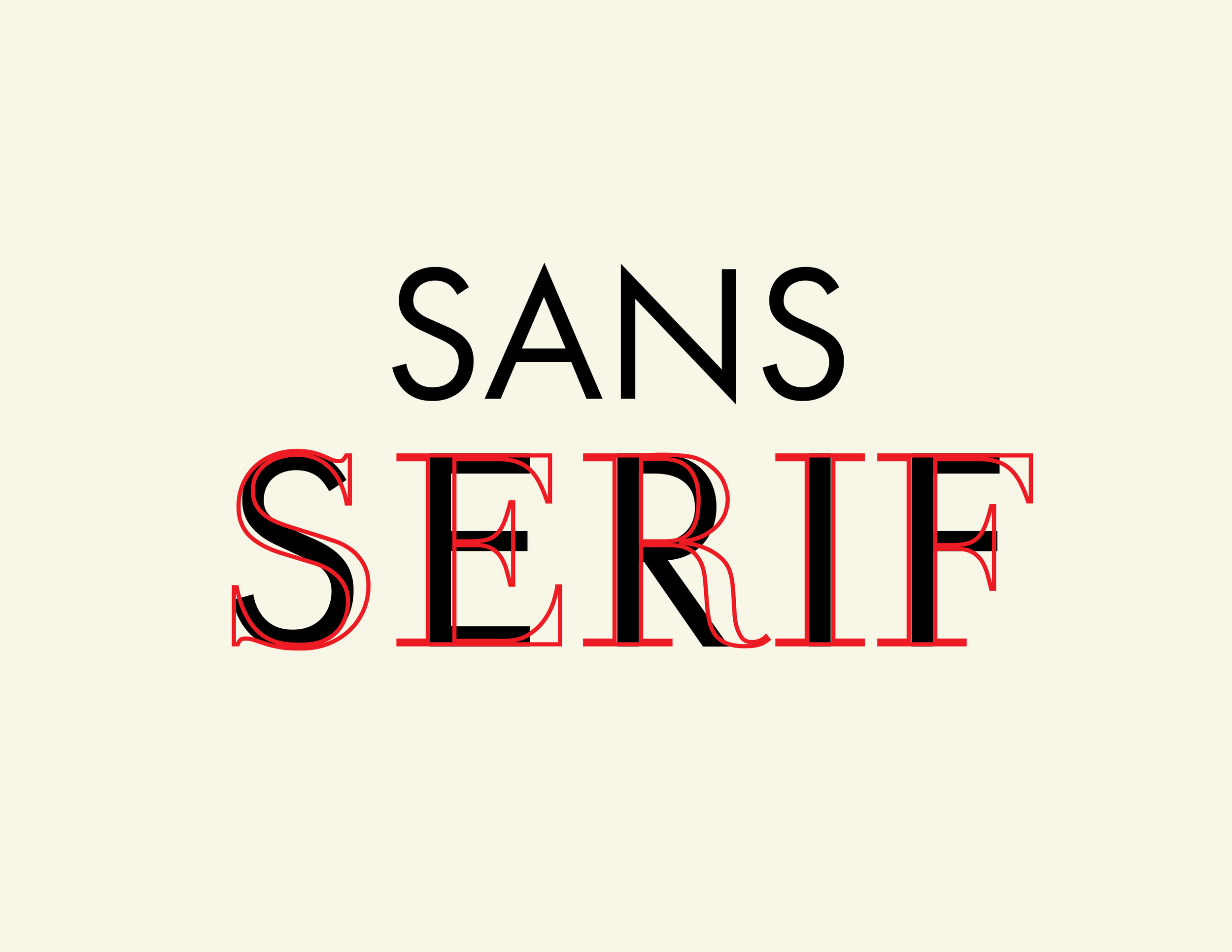
Serif vs. Sans-Serif: When and Why to Use Each
As I mentioned previously, typography is essential to a design. It often is the design. Part of typography is choosing the right typeface for your design. Most of the time, the decision is between a serif typeface or a sans-serif typeface. This simple choice can shape how your entire message is received. Before getting into when to use each, let’s break down what they actually are.
Serif vs. Sans-Serif
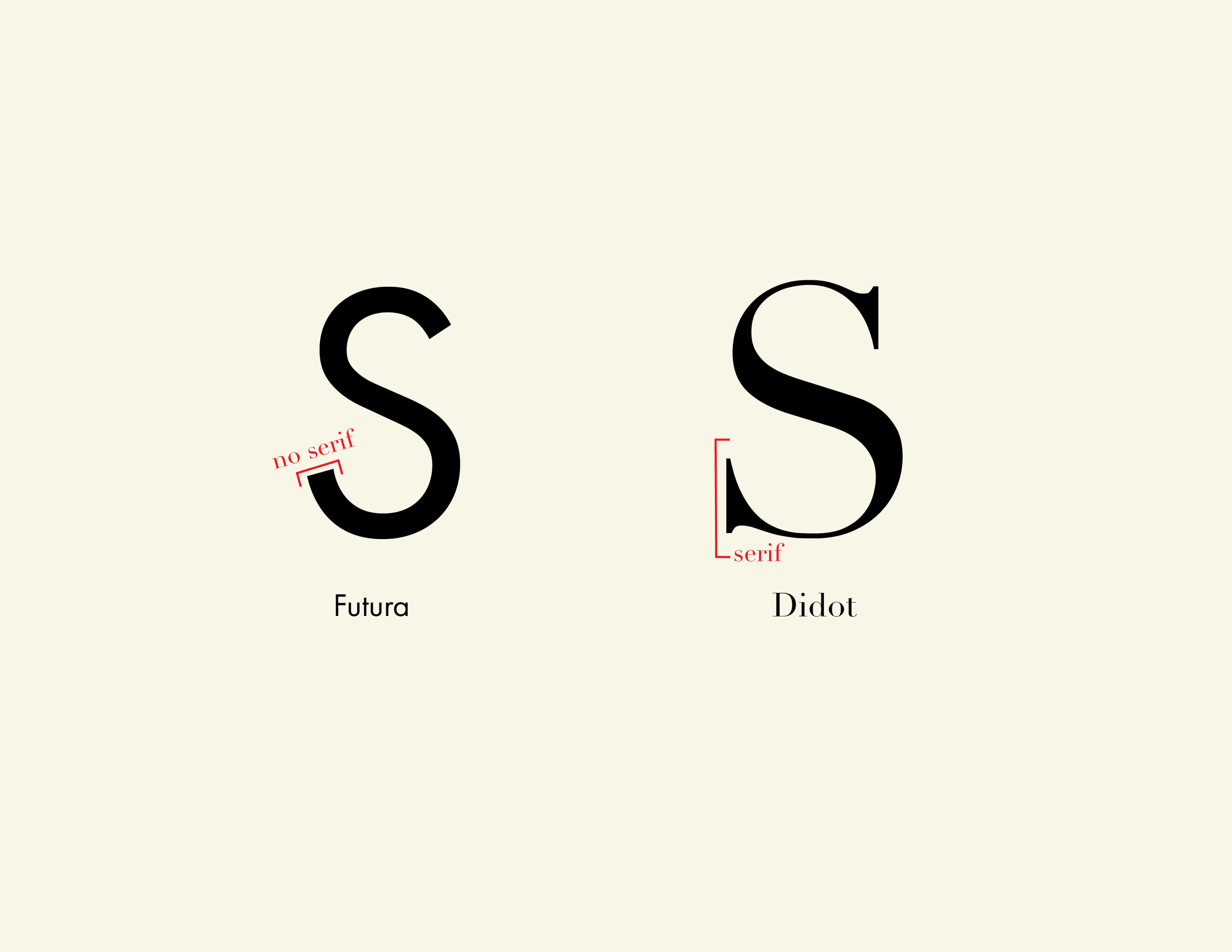
Aserif is the small extra stroke at the end of the main vertical and horizontal strokes of some letters. Some serifs are pronounced and obvious while others are subtle. Serif typefaces come in a variety of styles. They are usually described as hairline serifs, square or slab serifs, and wedge serifs. Hairline serifs are a lot thinner than the main strokes, while slab serifs are thicker and can be heavier in weight than the main stroke. Any typeface that includes these details falls into the serif category. A classic example of a serif typeface is Didot.
Asans-serif typeface is a typeface without serifs at the end of the strokes. These typefaces are usually all one weight. There is no transition between thick or thin in the strokes, they are the same thickness all around. Sans-serif typefaces are considered to be more modern and minimalist. There are different subcategories of sans-serifs, which includedgrotesque, geometric and humanist. Grotesque typefaces, like Franklin Gothic, do not have varying stroke widths, and the uppercase letters are uniform in appearance. Geometric have letter forms that are inspired by geometric shapes. Futura is a great example of this. Humanist typefaces, like Calibri, are inspired from traditional letterforms that vary between thin and thick strokes. It has loose letter spacing, wide counters and a large x-height.
These differences might be small, but visually it’s huge. Now that you know what each typeface is and their differences, let’s look into when and why to use them.
When and Why to Use Each
Choosing between these typefaces can be essential to your design. Each of these typefaces say something different. Each one carries a personality.
Serif typefaces are often known as the more traditional typeface with a sophisticated and classic look. They work well in print media, often used in books, newspapers, and magazines. Serif typefaces improve readability in printed materials by guiding the reader’s eye. They also work well when wanting to show that your work is trustworthy and reliable. When looking at brands, seeing them use a serif typeface makes them feel more established and trustworthy. They communicate stability.
Sans-serif typefaces are known to be more modern and minimalistic with a simple look. Sans-serif typefaces work well for digital media. They are the go-to for digital design. These typefaces have clean lines and a straightforward appearance that make them incredibly legible on screens. They also work well when there is not a lot of room for copy. Signs, text in apps, and names on maps are usually sans-serif.
Neither typeface is better, they just communicate different things.
Final Thoughts
Choosing between serif and sans-serif typefaces can be difficult. Unless you know what message you want to convey, you are basically starting from the beginning. It also depends on personal preference. I like a sans-serif typeface better than a serif typeface. I am more drawn the simple modern look of them. The strongest design, however, are not built on just preference they are built on purpose.

Hi I’m Rebecca Collins, and I am a graphic designer with a strong interest in branding, typography, and visual storytelling.
I love exploring how design can shape the way people experience information, whether through print, digital media, or motion.