What is Typography and Why it Matters in Design
Typography is everywhere. It’s in the headlines we scroll past, the packaging we pick up, the websites we click away from (or stay on). It quietly shapes how we feel about what we’re looking at before we’ve even read a single word. At the heart of every visual experience, typography determines how readers perceive, navigate, and emotionally connect with content. When it’s done well, you barely notice it. When it’s done poorly, you notice immediately.
Strong typography doesn’t just make text look good, it makes communication clearer, more intentional, and more memorable.
What Is Typography?
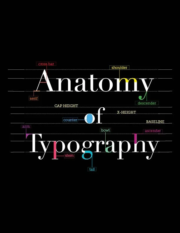
Typography is the art and technique of arranging type to make written language legible, readable, and visually engaging. But beyond the textbook definition, typography is about control. It’s about deciding what gets attention first, what feels calm or chaotic, what feels trustworthy or experimental.
It involves selecting typefaces, adjusting spacing, defining hierarchy, and shaping the overall rhythm of text. And while we often associate typography with digital design tools today, its roots stretch back centuries to early printing presses and hand-set type, when every letter was placed with purpose.
Typography isn’t decoration. It’s structure. It’s voice. It’s strategy.
Why Typography Matters in Design
1. It Makes or Breaks Readability
Have you ever tried reading something with tiny type, awkward spacing, or overly decorative fonts? It’s exhausting. Good typography removes friction. Designers carefully consider font size, line spacing, contrast, and alignment to create a smooth reading experience.
When typography fails, the message gets lost. When it succeeds, the message shines.
Typography also guides the eye. Through hierarchy designers signal what’s most important. Your eye knows where to go because the typography tells it where to go.
2. It Controls Flow and Structure
Typography is one of the most powerful tools for organizing information. A well-designed layout leads readers naturally from headline to subhead to body copy. It creates rhythm. It creates movement.
Without thoughtful typography, a page feels overwhelming or confusing. With it, content feels intentional and intuitive. That’s why typography is central to user experience design, it determines how quickly someone can scan, process, and absorb information.
3. It Carries Emotion and Personality
Fonts have personalities. A serif typeface can feel traditional or authoritative. A geometric sans serif often feels modern and clean. Scripts can feel elegant or expressive. Bold condensed fonts can feel loud and urgent.
This emotional layer, often called font psychology, plays a huge role in branding and visual communication. Typography is often the first impression someone gets from a brand. Before color. Before imagery. Before content.
The right type choice can communicate trust, playfulness, luxury, or innovation in seconds.
4. It Defines Brand Identity
Think about brands that feel instantly recognizable. Their typography is consistent, deliberate, and unmistakably theirs. Whether it’s the minimalist clarity associated with Apple, the classic editorial presence of The New York Times, or the playful simplicity of Google, typography becomes part of the brand’s voice.
Consistent typography builds recognition. It builds credibility. It builds emotional resonance. In a crowded digital space, those subtle differences matter.
Final Thoughts
Typography is far more than picking a “pretty” font. It’s a strategic design tool that shapes how people read, feel, and interact with content. It influences first impressions, clarity, and trust.
When you master typography, you’re not just arranging letters, you’re shaping experience. And in design, experience is everything.

Hi I’m Rebecca Collins, and I am a graphic designer with a strong interest in branding, typography, and visual storytelling.
I love exploring how design can shape the way people experience information, whether through print, digital media, or motion.