Club Softball Logo Redesign
Overview
Role: Designer | Duration: 5 weeks
The Quinnipiac Club Softball team needed a new logo that could be used on official team merchandise. The goal of this project was to create a strong and recognizable design that reflected the team’s identity while still aligning with Quinnipiac University’s established colors and branding. Since the logo would appear on apparel, it needed to be clear, bold, and easy to recognize in different formats.
Research & Inspiration
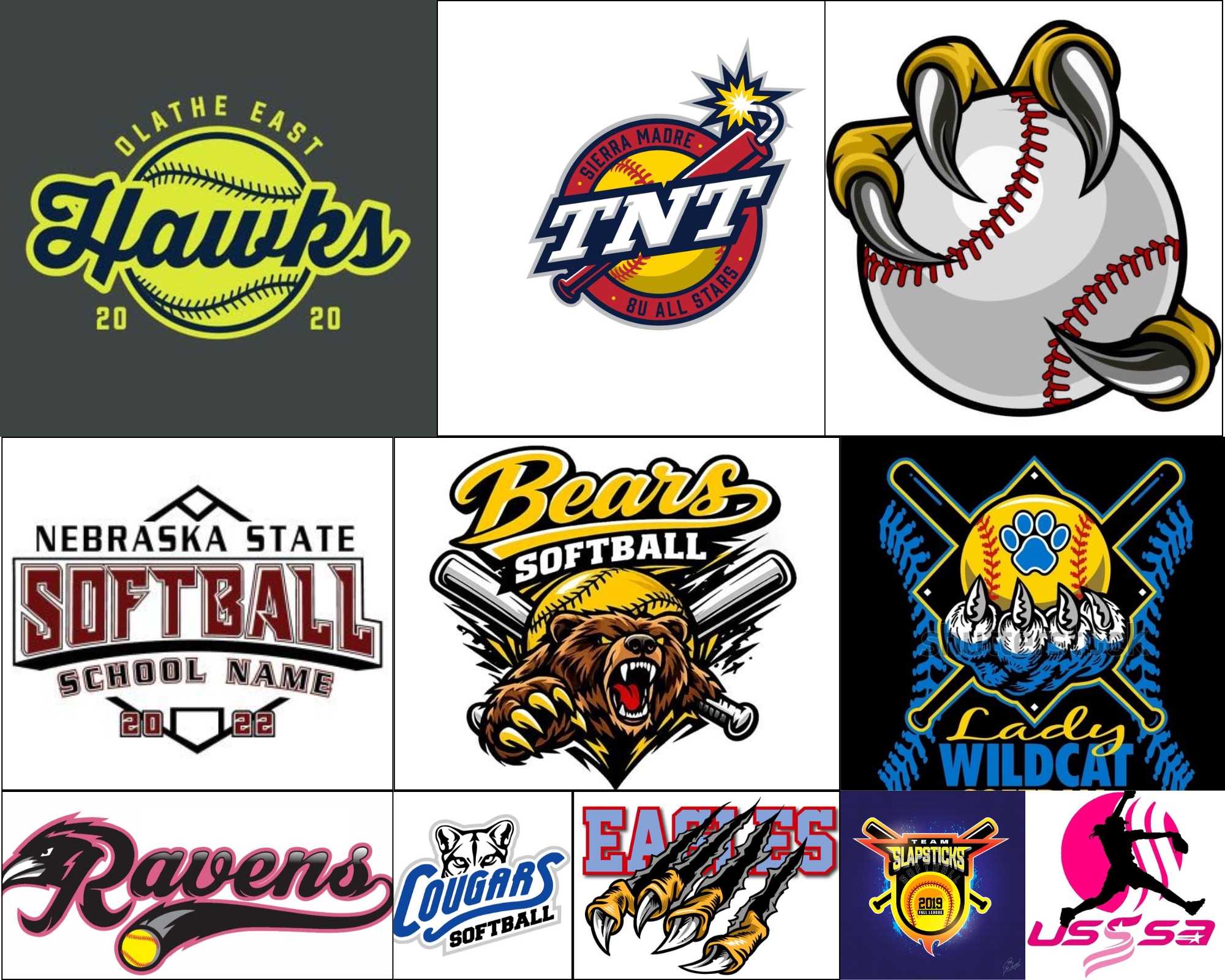
Before starting the design process, I looked at a variety of sports logos, specifically softball, to get a better understanding of what makes them effective. I gathered inspiration and reference images on Pinterest. This helped me notice common elements like bold typography, simple shapes, and strong imagery that stays recognizable when printed on apparel or seen from a distance.
This research helped guide the direction of my early sketches and gave me a better sense of how the final logo could feel both athletic and connected to the university.
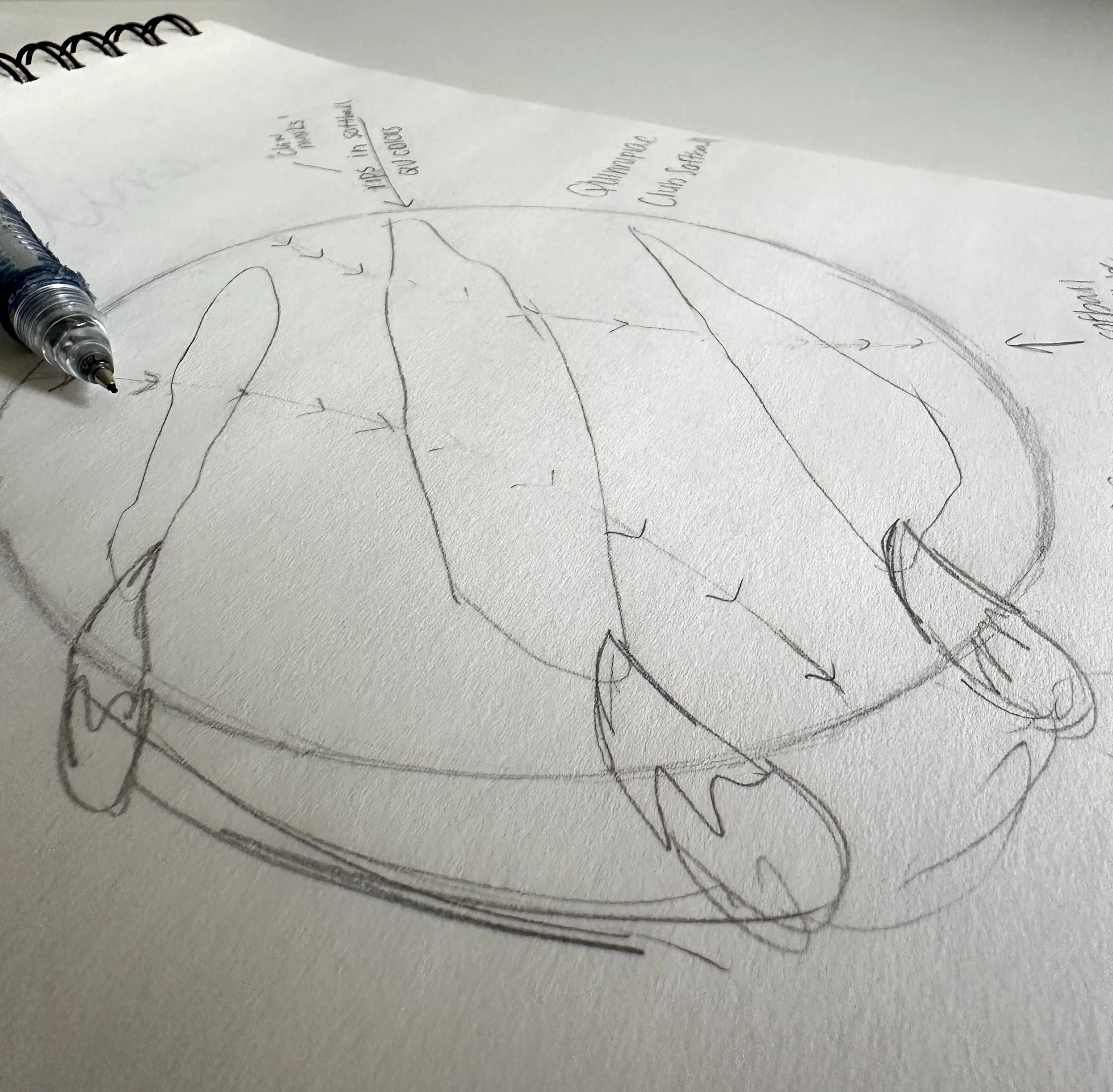
Ideation & Sketches
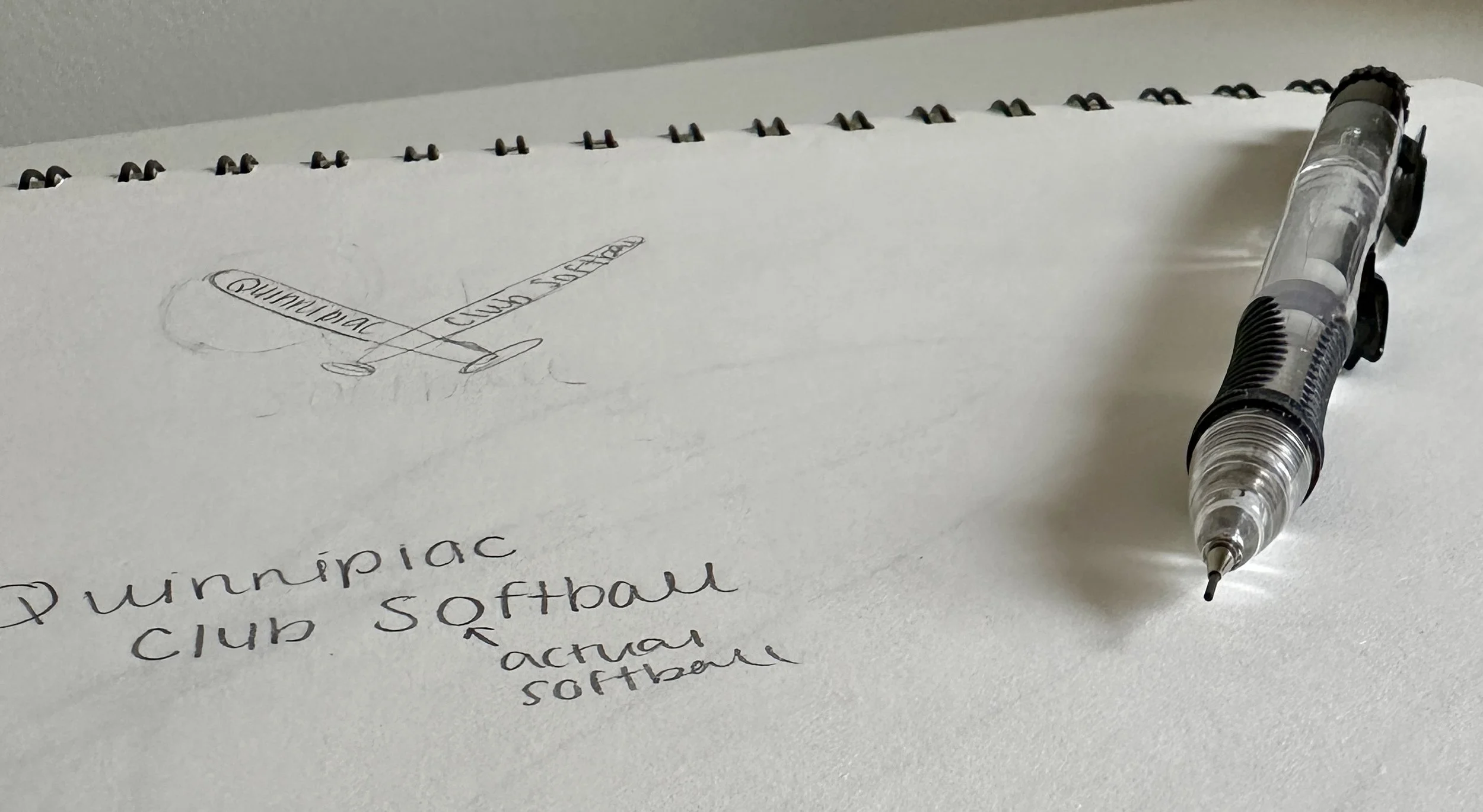
I started the project by sketching several possible logo ideas, experimenting with different ways to combine softball imagery with elements that reference the Quinnipiac Bobcat’s identity. I sent these sketches to the club president, who reviewed the concepts and selected the strongest one to move forward with.
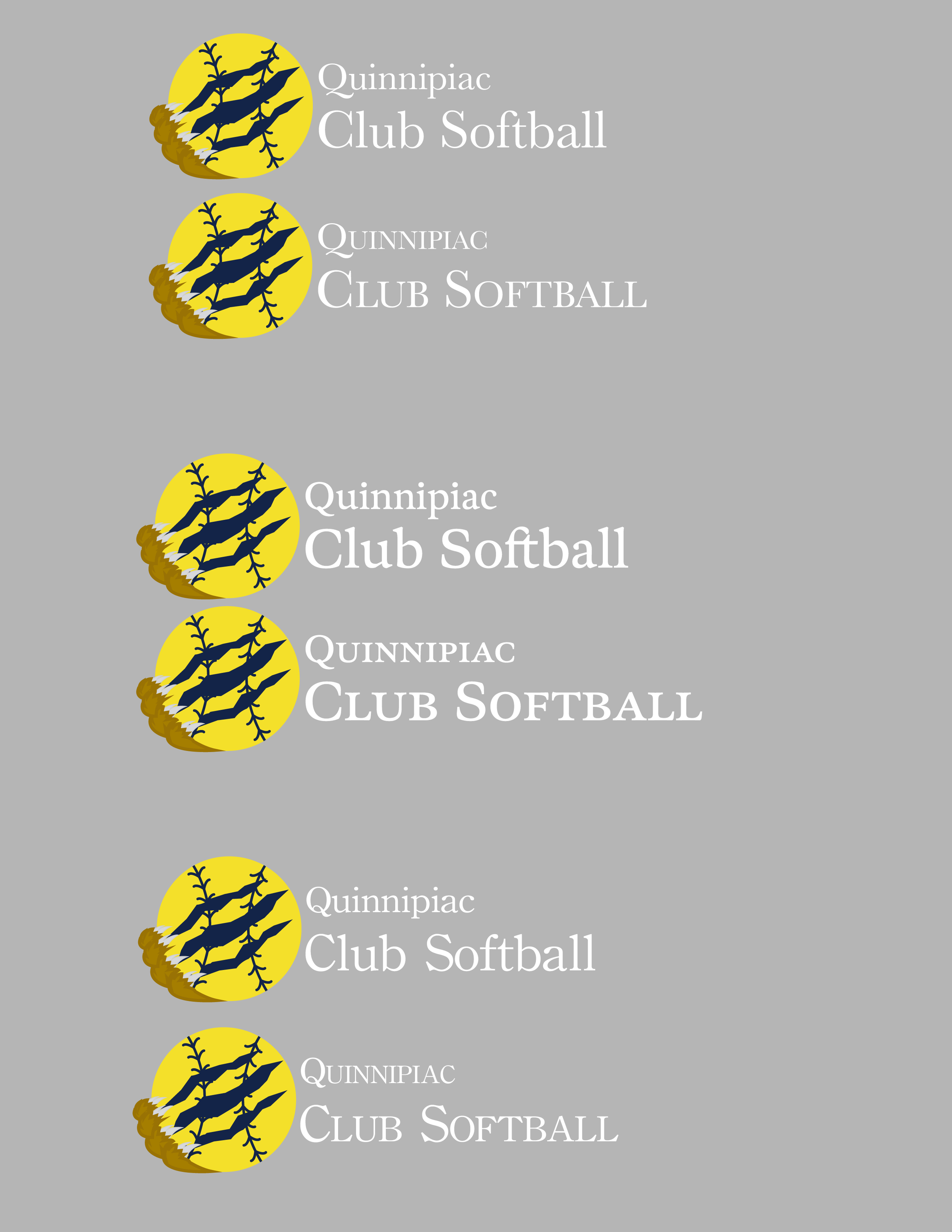
Digital Design & Iteration
After that, I recreated the chosen concept digitally and refined the layout. The club president then provided feedback about the typeface, so I made adjustments to improve the overall look and readability.
Once those revisions were complete, the logo was submitted to the university’s club sports branding team for approval. They requested a few additional changes, including adjusting the colors to match the official Quinnipiac palette and darkening the stroke color for better contrast. After making those revisions, the design was approved.
First Design
Type Choices
Color Change

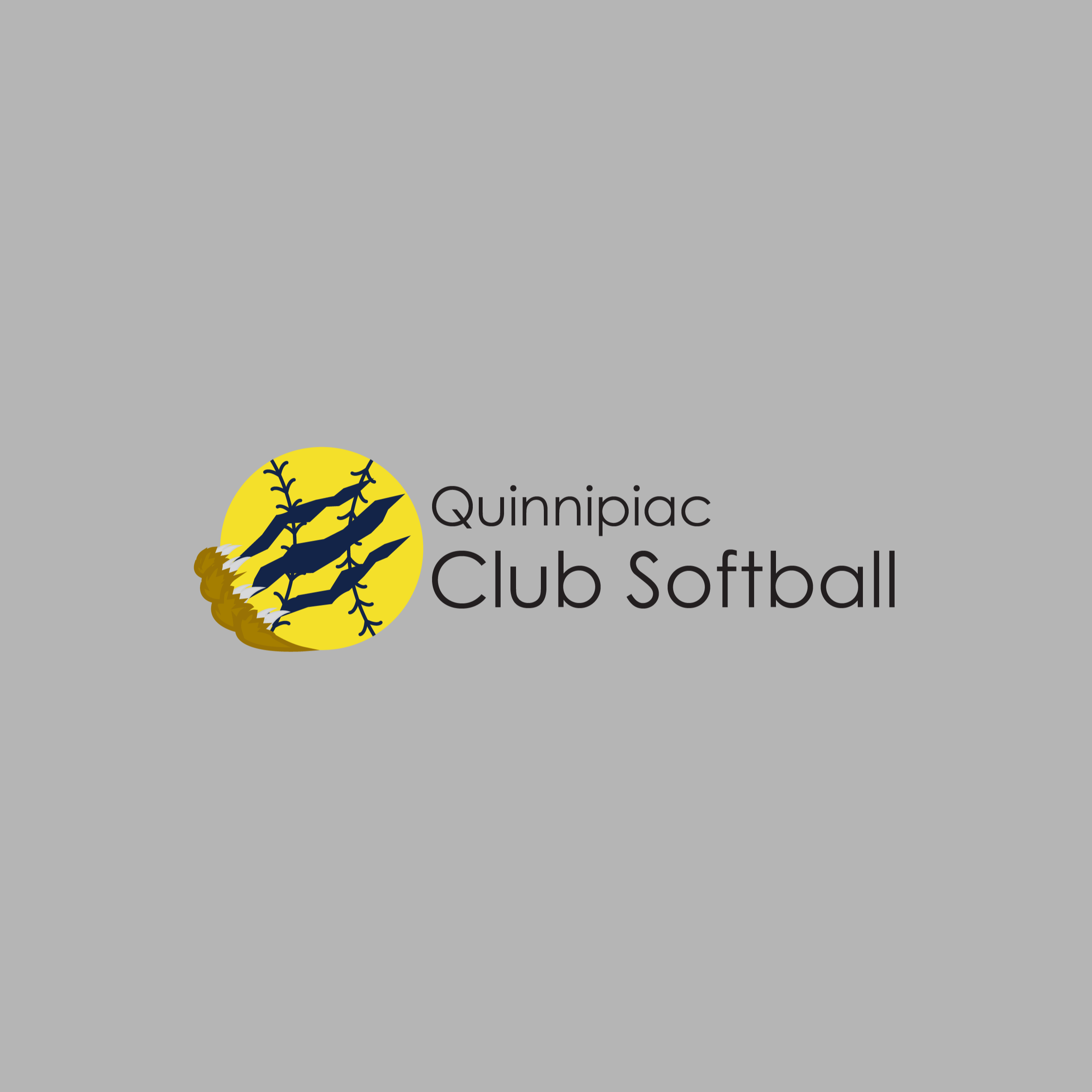
Final Product
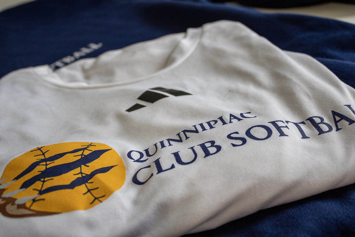
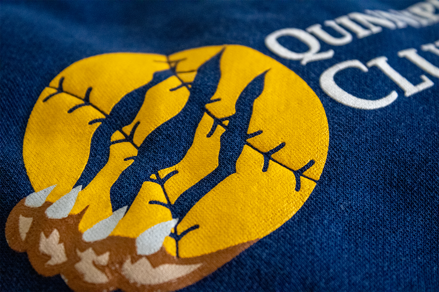
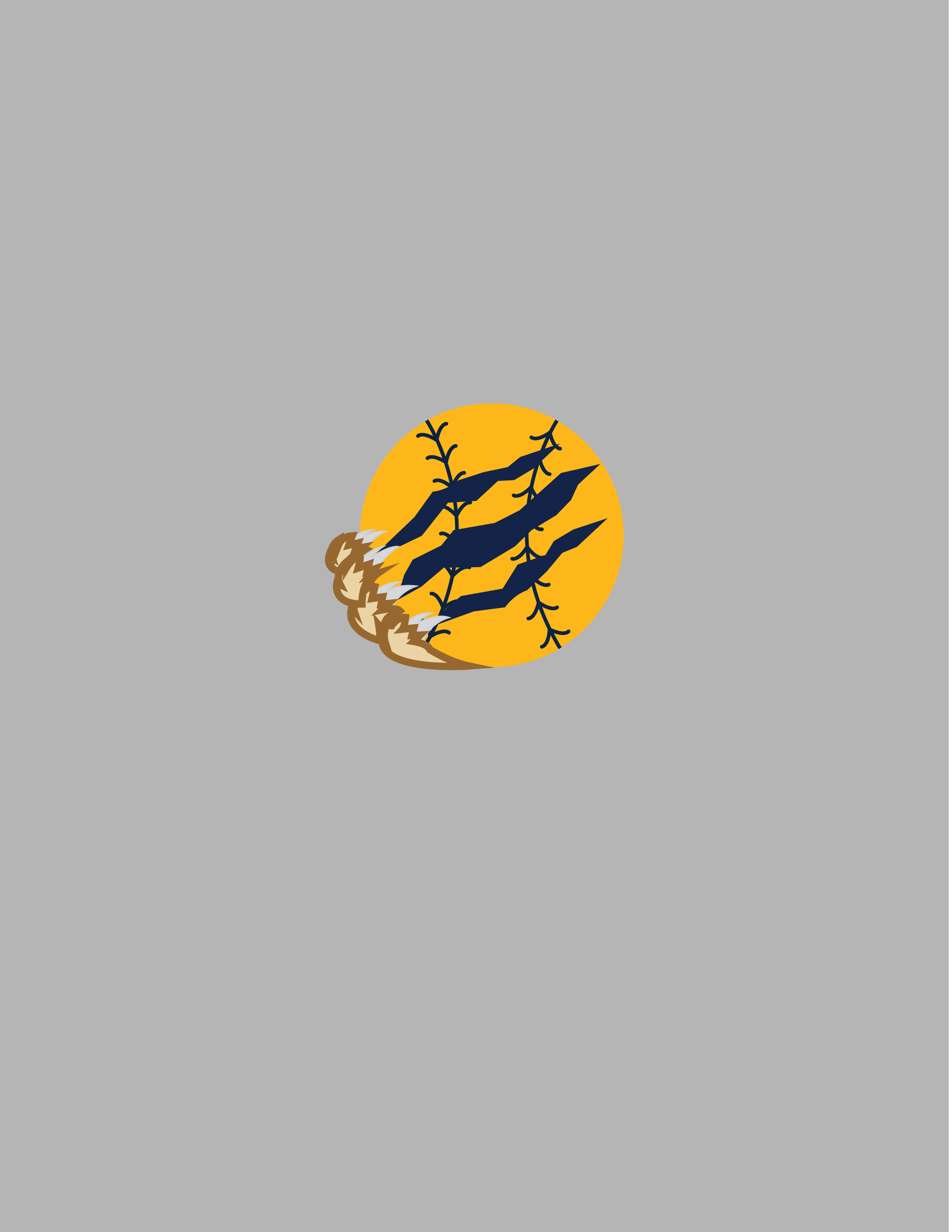
The final logo uses a circular yellow shape to represent a softball, immediately connecting the design to the sport. Claw marks cut across the ball, referencing the Quinnipiac Bobcat mascot and tying the logo back to the university’s identity.
The typography creates a clear hierarchy, with “Club Softball” emphasized so the team name stands out while still keeping “Quinnipiac” visible.
Using the university’s navy and gold color palette helps the logo feel consistent with Quinnipiac’s athletic branding while still standing out on team merchandise.


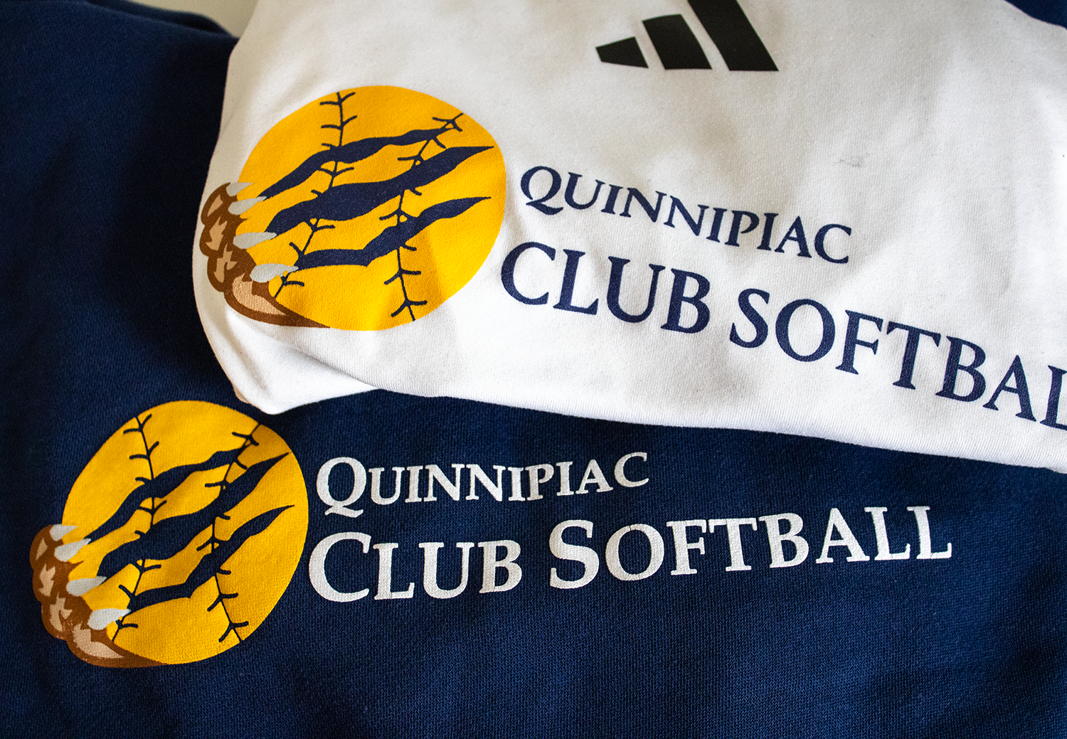
Outcome
The final logo was approved by both the club president and the university club sports branding team and was later used on new club softball merchandise. The project gave the team a stronger and more unified visual identity.
Working on this project also strengthened my experience collaborating with stakeholders, incorporating feedback, and designing within established brand guidelines.